
In 2010, a behavioral economist named Dan Ariely ran an experiment using a real pricing page from The Economist. Subscribers could choose between web-only access for $59, print-only for $125, or print-and-web for $125. The print-only option seemed insane. Nobody would buy it. And when Ariely removed it and re-ran the test, web-only subscriptions jumped dramatically. Without the absurd middle anchor, people defaulted to cheap.
The Economist almost certainly didn’t design that pricing page intentionally. But the companies that came after them absolutely did.
The Setup
Sometime around 2013, the SaaS pricing page became its own design discipline. You had Basecamp, Freshbooks, Mailchimp, and a dozen other bootstrapped-to-profitable software companies quietly running pricing experiments and talking to each other about what worked. What emerged wasn’t accidental. It was a framework.
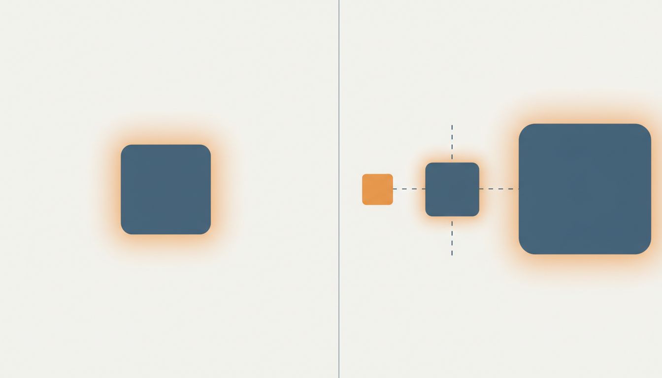
The framework looks like this: build three tiers. Make the cheapest tier feel genuinely limited, not just priced low. Make the most expensive tier feel slightly aspirational, maybe even a little wasteful for where most buyers are right now. Then build the middle tier to look, at a glance, like the obvious rational choice. Highlight it. Put a badge on it. Call it ‘Most Popular’ or ‘Recommended.’
But here’s what most people miss: the real work isn’t in the middle tier. It’s in the top one.
Basecamp’s pricing evolution is instructive here. For years they sold a flat-rate product at a single price, which was philosophically clean but left money on the table with larger teams who would have paid more. When they eventually introduced tiered pricing, the structure they built followed a pattern that had become common wisdom in the SaaS world: the top tier exists partly to make the middle tier look reasonable.
This isn’t manipulation in the sinister sense. It’s architecture. You’re building a context in which a price that once seemed significant now seems like the sensible middle path between two extremes. The psychological term is anchoring. The business result is that your average contract value goes up without you changing what anything actually costs.
What Actually Happened
Mailchimp is probably the clearest case study because their pricing page evolution is well-documented and the company talked about their decisions openly before the Intuit acquisition changed their communications posture.
For a long time, Mailchimp operated on a freemium model that converted well at the low end but created a ceiling problem. Power users were getting enormous value and paying almost nothing. When they restructured around tiered paid plans, the pricing page design made an argument: here’s what you get for a little, here’s what you get for a lot, and here’s this middle option that gives you most of what matters at a price that feels proportionate.
The anchor at the top wasn’t meant to sell. It was meant to reframe. A $300-per-month plan makes a $99-per-month plan feel like restraint rather than expense. The customer who was going to spend $99 doesn’t feel like they’re spending $99. They feel like they’re saving $200.
This is the trick that took a while to name clearly: the top tier doesn’t need to convert well to earn its place on the pricing page. It earns its place by existing. Software companies have been running this kind of silent experiment on customer behavior for years, and pricing pages are one of the highest-leverage surfaces they have.
Freshbooks did something similar and was unusually transparent about it in founder interviews. They found that adding a higher tier and visually emphasizing the middle tier increased average revenue per user even when almost nobody bought the top tier. The conversion rate on the top plan was low. The effect on overall revenue was significant.
Why It Works
Humans are bad at absolute value judgments and good at relative ones. If I ask you whether $99 is a fair price for project management software, you’ll struggle. You don’t have a clear reference point. But if I show you that the alternative is $249, and the barebones version is $29 with a list of alarming limitations, your brain does the comparison quickly and confidently. $99 starts to feel correct.
This is anchoring in its simplest form, but SaaS companies have refined it considerably. The most sophisticated implementations do a few things beyond just listing three prices:
They make the free or entry tier feel actively uncomfortable. Not dishonestly limited, but limited in ways that matter to their actual target customer. If your target customer needs team collaboration, the free tier doesn’t include it. Not because it would be hard to include, but because its absence is doing work.
They design the top tier to include things that sound impressive but that most buyers will honestly admit they don’t need yet. Dedicated support. Custom contracts. SSO. Advanced analytics. These features are real and genuinely valuable to enterprise buyers, but for the mid-market customer standing at the pricing page, they function as signals that the top tier is for someone else, someone bigger. The customer self-selects into the middle.
And they make the middle tier feel complete. Not like a compromise. Complete.
What We Can Learn
The pricing anchor strategy works, but it’s easy to implement badly. A few failure modes are worth naming.
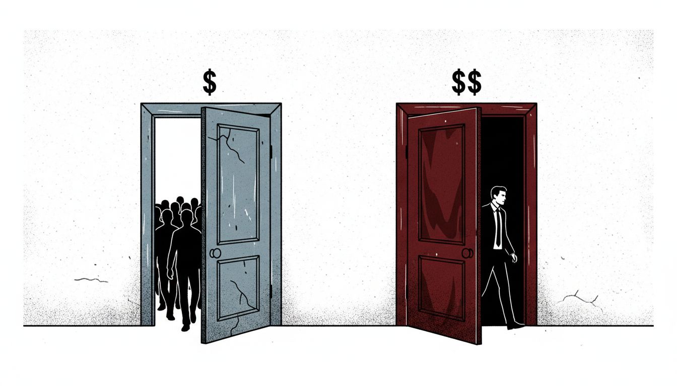
The first is making the top tier too expensive to be credible. If the jump from middle to top is five times the price with marginal feature additions, the anchor loses its power. Customers don’t think ‘the middle tier is a bargain.’ They think ‘something is wrong with this company’s pricing.’ The anchor needs to be reachable, even if most customers don’t reach it.
The second failure mode is building a free tier that’s too good. This sounds counterintuitive, but a free tier that meets most customers’ needs doesn’t convert. It just grows a user base of people who will never pay. The free tier has to create genuine pain at scale, the kind of pain that a growing team actually feels. Otherwise you’ve built a charity.
The third failure mode is treating the pricing page as a set-it-and-forget-it decision. The companies that do this well run it like a product. They test tier names, feature placement, what goes in the highlight box, whether the price is shown monthly or annually by default. Every element is a variable.
The deeper lesson here isn’t really about pricing. It’s about the fact that your product’s value isn’t self-evident to customers, and the frame you build around the price is part of the product. A pricing page that makes the right tier feel obvious is doing real work. It’s reducing friction, making a decision easier, and meeting the customer where they actually are rather than where you wish they were.
Basecamp, to their credit, eventually moved back toward flat-rate pricing for different philosophical reasons. They’ve argued publicly that variable seat-based pricing misaligns incentives between companies and their customers. That’s a legitimate position. But the market largely didn’t follow them, because the anchor model works too well for companies that are optimizing for revenue growth over philosophical consistency.
The pricing page is one of the most honest places a startup can tell you what they think of their customers. And the ones with three tiers, a highlighted middle option, and a top tier priced just high enough to make you feel smart for not choosing it? They’ve done their homework.