

Ask a roomful of software engineers why they use dark mode and you’ll hear the same answers every time: easier on the eyes, better for late nights, looks cleaner. All of those things are true enough. But they’re also a little like saying you drive a sports car because it has good cup holders. The surface explanation isn’t wrong, it just completely misses the point.
The real reason dark mode dominates developer culture is rooted in how the human brain processes visual information during sustained, high-precision cognitive work. It’s about signal-to-noise ratio at the neurological level, and once you understand the mechanism, you’ll never think about your color scheme the same way again. This same principle, reducing cognitive noise to unlock deeper focus, shows up in a lot of unexpected places in tech, including how elite software teams ship three times faster using cognitive science tricks most developers have never heard of.
The Physics of Light and Why White Backgrounds Are Hostile
Your monitor is not a piece of paper. This sounds obvious but it has enormous practical consequences that most developers only understand intuitively.
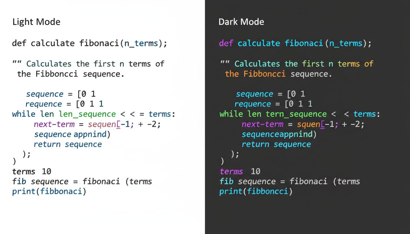
Paper reflects light. A monitor emits it. When you look at a white background on a screen, you are staring directly into a light source. Every pixel set to #FFFFFF is a tiny LED (or backlit liquid crystal) firing at full brightness directly into your retina. The effect is called positive polarity (dark text on light background), and while studies have shown it marginally outperforms negative polarity (light text on dark background) for reading comprehension in short bursts, it comes at a real physiological cost over hours.
The culprit is something called the Halation Effect. When a very bright area surrounds smaller, darker elements, the brightness bleeds into the perception of those elements, reducing their apparent sharpness. In practical terms, this means your black #000000 function names on a white background look slightly fuzzier than they actually are, because your visual cortex is being overwhelmed by the surrounding luminance. Reducing the background brightness eliminates that bleed, making fine details like the difference between == and ===, or a misplaced semicolon, snap into clearer focus.
Syntax Highlighting Hits Different in the Dark
Here is where things get genuinely interesting from a cognitive science perspective.
Modern code editors use syntax highlighting, the practice of color-coding different parts of your code based on its grammatical role. Keywords like if, return, and class get one color. Strings get another. Comments get another. Variables, functions, operators, they all have their own visual lane.
The purpose of syntax highlighting is to let your brain parse code structure without consciously reading every word. It’s pattern recognition offloaded to the visual system, which processes color and shape in parallel rather than sequentially. You literally see the structure of the code before you read it.
Now here’s the catch: syntax highlighting relies on hue differentiation. On a white background, colors have to compete with the brightness of the canvas itself. Saturated yellows, greens, and cyans, which are incredibly common in popular color schemes, get washed out against white. Dark backgrounds increase the perceived saturation and luminance contrast of every color placed on them, which means your syntax highlighting communicates more information, more quickly, with less conscious effort.
This is not a small thing. A senior developer scanning a 200-line function is doing something more like reading a musical score than reading a novel. The structural information, the rhythm and shape of the code, matters as much as the literal content. Dark mode makes that score easier to sight-read.
The Attention Economy of Your Own Brain
There’s another layer here that rarely gets discussed: peripheral vision.
When you’re coding, your primary focus is on a relatively small region of the screen, maybe 20 to 30 lines of code in your active editing window. But your visual field extends well beyond that, and your brain is constantly monitoring the periphery for relevant signals. On a light-themed editor, every bright white area in your peripheral vision is registering as a potential signal. Your brain isn’t smart enough to know in advance that the whitespace is empty, so it keeps checking.
Dark mode reduces the luminance of those peripheral regions significantly, which lowers the background neural activity required to monitor them. The result is a quieter visual environment, one that allows your prefrontal cortex (the part doing the actual thinking) to operate with less interference. This is essentially the visual equivalent of what successful teams achieve when they delete half their communication channels and become twice as fast. Fewer signals competing for attention means more bandwidth for the signal that matters.
This also explains something that purely ergonomic accounts of dark mode miss: developers often prefer dark mode even in bright, well-lit office environments where eye strain isn’t a significant factor. The preference isn’t just about comfort. It’s about the quality of focus the environment enables.
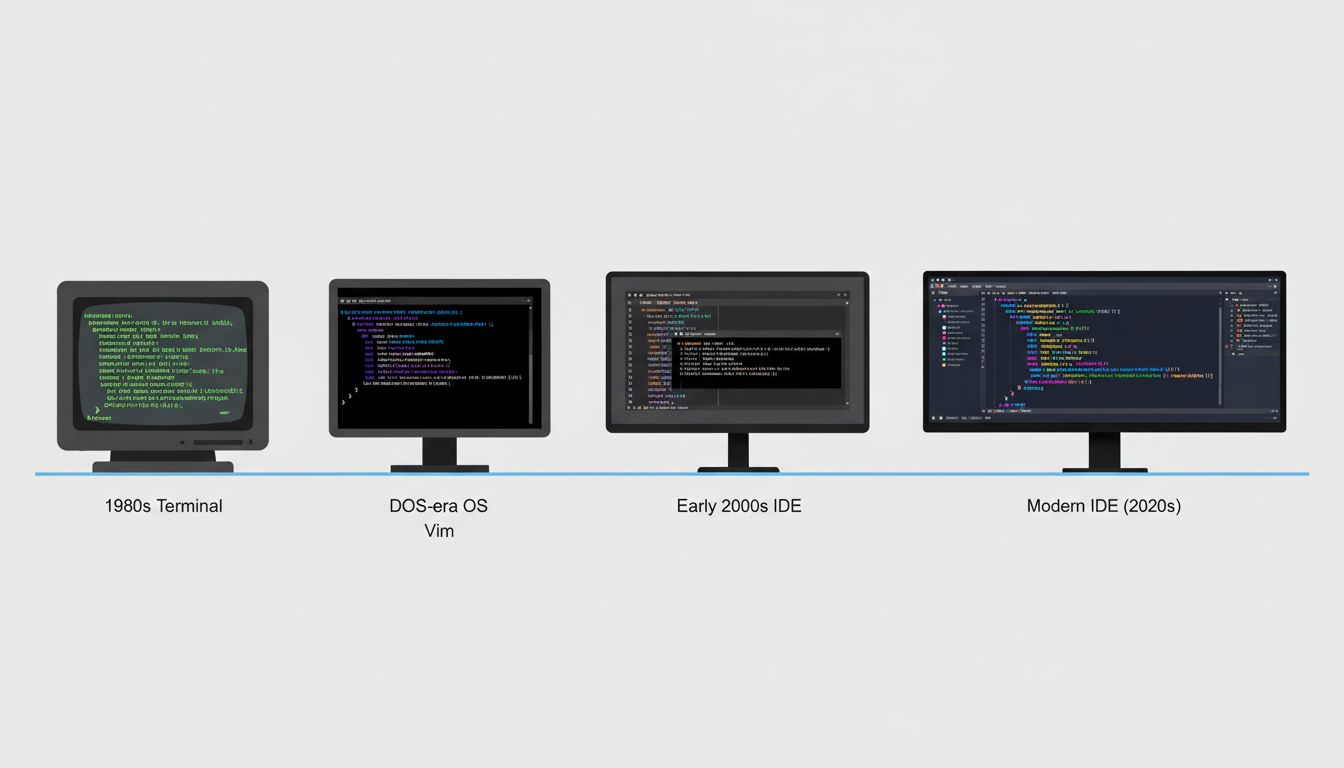
Why IDEs Got Dark Mode Before Consumer Apps
It’s worth pausing to note that dark mode was standard in developer tools for decades before it became a consumer trend. Terminal emulators, from the original VT100 to modern iTerm2, default to light text on dark backgrounds. Vim’s default colorscheme is dark. The first version of what became Visual Studio Code launched with a dark default theme.
This wasn’t aesthetic preference, it was organic selection pressure. Developers are power users of text interfaces who spend more focused hours staring at text than almost any other professional group. Over decades, the tooling converged on dark mode because the people who built the tools were also the heaviest users, and they noticed what worked. This is a pattern you see repeatedly in how developer tools evolve, shaped relentlessly by the cognitive needs of the people building them.
The consumer adoption of dark mode came much later, driven partly by OLED display technology (where true black pixels are literally off, saving battery) and partly by the cultural signal that dark mode sends. But the developer community didn’t adopt it for aesthetics. They adopted it because it made the work better.
The Deeper Pattern
What’s really going on with dark mode preference is a story about optimizing an environment for a specific type of cognitive work. Reading prose and debugging a recursive function are not the same cognitive task, and they don’t necessarily benefit from the same visual environment.
This matters beyond color schemes. The most effective developers tend to be people who think carefully about the full stack of conditions surrounding their work, not just the code itself. Tool configuration, keyboard shortcuts, window layout, notification management, these aren’t distractions from real work. They are the infrastructure that makes real work possible. It’s the same reason that, as research on tech workers using paper notebooks shows, the medium shapes the thinking, sometimes more than we expect.
Dark mode, at its core, is a developer’s way of saying: I understand how my brain works, and I’ve configured my environment accordingly. That instinct, applied consistently across tooling, process, and practice, is a significant part of what separates good engineers from exceptional ones.
So yes, dark mode is easier on the eyes. But more importantly, it’s easier on your mind.