Software used to reward learning. The more time you spent with Vim, or AutoCAD, or even early Photoshop, the faster and more capable you became. There was a real skill ceiling, and reaching it felt like something. The software remembered that you were a power user, and it treated you accordingly.
That relationship is largely gone now. Not because of technical limitations, and not because users got dumber. It happened because the business model changed, and the design followed the money.
Retention metrics punish depth
Modern software teams live or die by retention numbers, specifically daily active users and monthly active users. These metrics measure frequency of return, not quality of use. They don’t distinguish between a user who does something meaningful every day and a user who opens the app, stares at it for forty seconds, and closes it.
This creates a perverse pressure. A feature that makes experienced users dramatically faster is often invisible in the metrics. A feature that gives casual users a small daily nudge to return shows up clearly. So product teams, who are rational actors optimizing for the numbers they’re measured on, build the second kind of feature. Over and over.
The result is software that nudges, reminds, and gently re-engages rather than software that deepens. The notification is always available. The tutorial is always ready to restart. The interface never assumes you’ve learned anything since yesterday.
Complexity is a churn risk
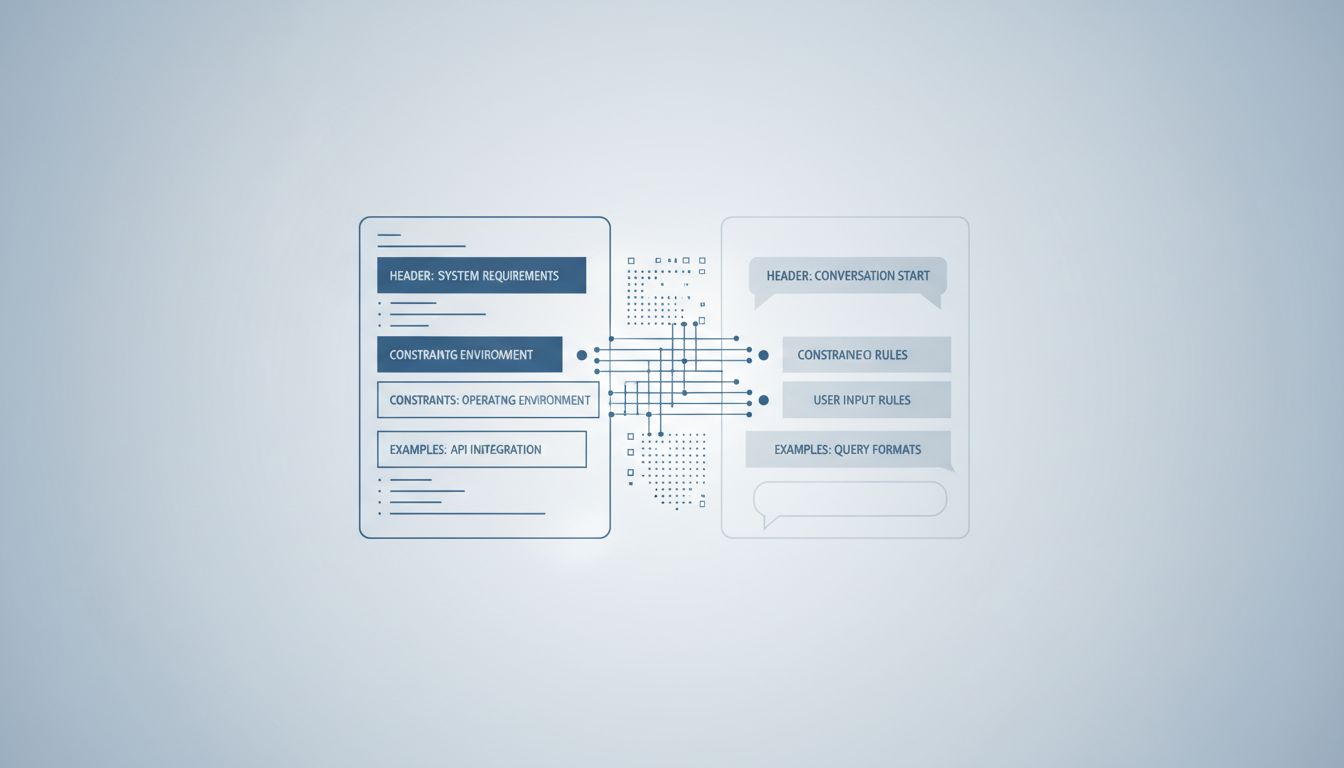
There’s a product management principle that goes roughly like this: every step between a new user and their first moment of value is a place they might leave. This is true. The problem is that teams apply this principle not just to onboarding but to the entire product lifecycle.
If you design software for the user who has been using it for three years, you scare off the user who showed up three days ago. And since acquiring new users is expensive and churn is always happening, the economics push you toward designing for the newcomer permanently. The expert user becomes, at best, an afterthought served by a “pro mode” toggle that nobody on the product team actually uses.
Professional tools that resisted this pressure, like JetBrains IDEs or Ableton Live, are now genuinely unusual. Tech companies deliberately hide their most powerful features from new users and the logic there is sound as far as it goes. But hiding features is different from not building them. Many consumer apps are taking the second path.
Mastery creates independence
Here is the uncomfortable truth that nobody in a product meeting says out loud: a user who has genuinely mastered your software is harder to manipulate and less dependent on your guidance. They’ve internalized the tool. They don’t need the app to tell them what to do next, which means the app loses its leverage.
Compare this to software designed around shallow engagement. The user who never quite learns the system needs to return to the interface to remember how things work. They’re more susceptible to prompts, more reliant on the app’s framing of their own behavior, more likely to respond to a re-engagement email. The forgettable app isn’t a design failure. It creates a dependency loop that a well-designed, learnable tool would break.
This isn’t a conspiracy. Nobody writes in a product spec that they want to keep users confused. But the structural incentives produce the same outcome as if they had.
The subscription model makes this worse
Before subscription pricing became dominant, there was at least some pressure to justify an upgrade. You had to give users a reason to pay again. That meant building features with enough depth that experienced users would want more of them.
Monthly subscriptions flip this. The goal isn’t to impress you with depth, it’s to avoid giving you a clear reason to cancel this month. That’s a much lower bar, and it’s a bar that shallow, habitual engagement clears easily. A tool you use out of mild inertia every few days is a perfectly successful subscription product by this logic, even if you’ve never learned to use it well and never will.
The counterargument
The obvious pushback is that accessible software has democratized things that used to require years of training. This is real. GarageBand let people make music who couldn’t afford Pro Tools or the decade it took to learn it. Canva brought design tools to people who had no path into Illustrator. These are genuine goods.
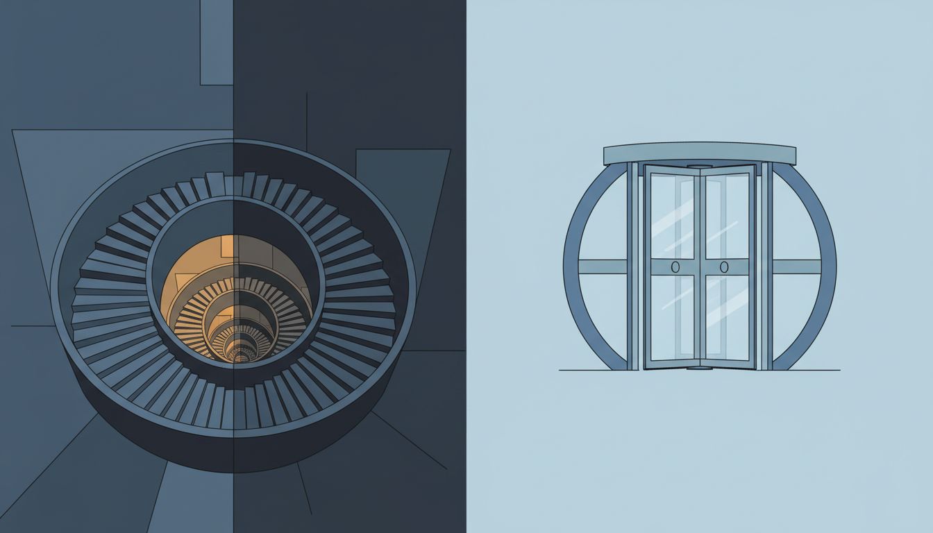
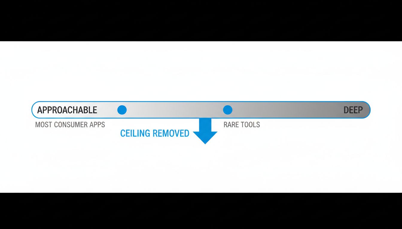
But there’s a difference between lowering the floor and removing the ceiling. A well-designed learnable tool can have both. The problem is that removing the ceiling is cheaper, easier to A/B test, and better for the engagement metrics. So that’s what happens, and “accessibility” becomes the post-hoc justification for a decision that was mostly economic.
The truly great tools in software history, the ones developers still argue about decades later, managed to be approachable and deep at the same time. That’s hard to build. It requires caring about the user who comes back after two years as much as the user who showed up this morning.
Software that respects your time makes itself unnecessary
The most honest version of this argument is simple: software that genuinely serves users should be trying to make itself less necessary over time, not more. A great calendar app should help you build habits so good you barely need it. A great writing tool should get out of your way as you get better.
Instead, most software is engineered toward the opposite goal. It wants to remain indispensable by keeping you slightly uncertain, slightly dependent, slightly short of the fluency that would let you ignore it for a week without anxiety.
This is a choice. The design follows from the incentives, the incentives follow from the business model, and the business model was chosen by people who could have chosen differently. The forgettable app is not an accident of complexity or market pressure. It is, in the most precise sense, the product.