
The Simple Version
Tech companies hide powerful features from new users because showing everything at once causes people to quit. The technique has a name, a logic, and a dark side worth understanding.
What Progressive Disclosure Actually Means
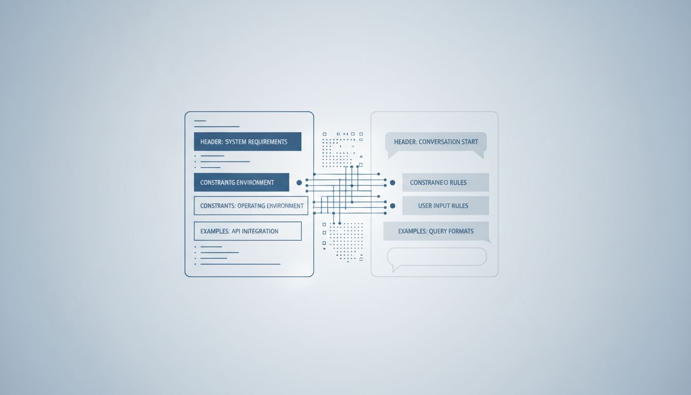
The design term for this is progressive disclosure. The idea is simple: present only the information and options a user needs right now, and reveal more complexity as they demonstrate readiness for it. Think of it as a tutorial level in a video game. You don’t hand someone a controller and immediately throw them into the final boss. You start with “press A to jump.”
This is not a new idea. It traces back to cognitive load theory, developed by educational psychologist John Sweller in the 1980s. The core finding was that working memory is limited, and presenting too many choices or too much information simultaneously degrades both learning and performance. Interface designers picked this up and ran with it.
The practical implementation looks something like this: Gmail shows you Compose, Inbox, and Sent. The filters, mail delegation, advanced search operators, and scripting via Google Apps Script are all buried. They exist. Millions of power users rely on them. But a new user signing up today won’t see them on day one, and Google is not sorry about that.
Why Hiding Features Is Often the Right Call
Here’s the thing that took me a while to accept: for most users, in most situations, this approach works. There’s solid research from the Nielsen Norman Group showing that users consistently rate simpler interfaces as more trustworthy and easier to learn, even when those interfaces give them objectively less capability.
Consider what happens when you violate this principle. Early versions of Microsoft Word are a canonical example of feature overload. By the mid-2000s, Word had accumulated so many toolbar buttons and menu options that Microsoft’s own research found users couldn’t locate features they knew existed. This was a direct contributor to the ribbon redesign in Office 2007, which reorganized (and somewhat hid) functionality behind task-oriented tabs. Controversial at launch, but it genuinely improved discoverability for common tasks.
The same logic applies to AI tools right now. If you opened a raw API call to GPT-4 on day one, with all the parameters exposed (temperature, top-p, frequency penalty, system prompts, token limits), most people would close the tab. The consumer wrapper that hides those controls isn’t dumbing things down. It’s removing obstacles to first use. Getting someone to first use is a prerequisite for getting them to second use.
Where This Gets Cynical
Progressive disclosure as a design principle is defensible. Progressive disclosure as a business strategy has a shadier twin.
When companies hide powerful features not because users aren’t ready, but because those features are locked behind a paid tier, the framing shifts. You’re no longer managing cognitive load. You’re manufacturing it. You show users enough to become dependent, then reveal that the thing they actually need costs more.
Freemium software does this almost universally. Notion’s free tier is genuinely useful, until you hit the block limit and discover that unlimited usage requires a subscription. Figma lets you create projects for free, until you need more than a handful of files and suddenly the pricing page appears. This isn’t progressive disclosure in the Sweller sense. It’s deliberate feature rationing to create upgrade pressure.
The more sophisticated version involves hiding features that would accelerate a user’s ability to evaluate the product honestly. If a project management tool buries its export function (so your data is hard to extract), or hides its API documentation from free-tier users (so integration with other tools requires upgrading first), that’s not protecting you from complexity. That’s protecting the company from competition.
The Real Cost to Users
The consequence that doesn’t get talked about enough is capability asymmetry. Power users who know a tool deeply get dramatically better outcomes than casual users working with the same tool. This is obvious in software development (a developer who knows their editor’s full keybindings and plugin ecosystem is not doing the same job as someone using the same editor with default settings), but it applies everywhere.
In Photoshop, a user who has discovered layer masks, smart objects, and adjustment layers is working in what is functionally a different application than someone who only uses the top-level toolbar. Both are using Photoshop. The capability gap between them is enormous. Progressive disclosure, when it works correctly, is supposed to bridge that gap by surfacing complexity as users are ready for it. When it works incorrectly, or cynically, it just leaves most users permanently at the shallow end.
The practical advice here is boring but true: for any tool you use seriously, spend a few hours reading its documentation or watching advanced tutorials, not beginner ones. The features companies hide from new users are frequently the features that make the tool worth using. Keyboard shortcuts, bulk operations, scripting interfaces, API access, export options, view customizations. These things exist. They are just behind a door the product designer decided not to put a sign on.
How to Think About This When Evaluating New Software
When you’re assessing a new tool, the question worth asking is not “is the interface simple?” but “what is this interface hiding and why?”
A simple interface that reveals depth over time as you explore it is well-designed. A simple interface that hides depth permanently behind a paywall is a business model dressed as UX. A simple interface that hides depth because the product genuinely doesn’t have any is a warning sign that the tool will stop serving you the moment your needs grow.
The tells are usually findable with a bit of poking. Look for a keyboard shortcuts page. Look for API documentation. Look for an advanced settings section. Look for community forums where power users discuss workarounds. If those things exist and are accessible, the simplicity is probably a considered design choice. If they don’t exist or require payment to access, you’re looking at a product built around a specific theory of how much you should be allowed to know.