
There is a variable reward schedule baked into almost every app you use daily. Pull to refresh on Twitter, scroll past the fold on TikTok, open Snapchat streaks, watch the notification badge pulse red. None of this happened by accident. These are deliberate, documented design patterns, and the engineers who built them studied the same behavioral psychology papers that casinos used to design slot machines. The difference is that slot machines require a physical trip to Las Vegas. Your phone is in your pocket.
Understanding why this works, and why companies are now slowly walking it back, requires understanding both the psychology and the engineering. This is not a moral panic piece. It is a technical teardown. And if you want the full economic context for why “free” apps were incentivized to build this way in the first place, the economics of free app development explains the underlying business pressure that made addictive design almost inevitable.
The Variable Reward Schedule, Explained in Code
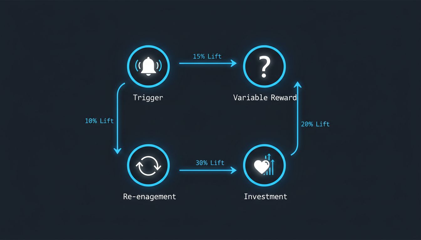
B.F. Skinner figured out in the 1950s that animals (including humans) respond most compulsively to unpredictable rewards. Fixed rewards, like getting a treat every single time you press a lever, produce consistent but not obsessive behavior. Variable rewards, where the treat comes sometimes, produce frantic, persistent lever pressing. Psychologists call this a variable ratio reinforcement schedule.
Now think about what the “pull to refresh” gesture actually is. You pull down, and you either get new content or you don’t. The engineering team at Twitter did not accidentally make this feel like a slot machine lever. Loren Brichter, who built the gesture, later said publicly that he regretted inventing it. The mechanic maps almost perfectly onto Skinner’s variable ratio schedule:
function pullToRefresh() {
  const newContent = fetchLatestPosts();
  if (newContent.length > 0) {
    // Reward: dopamine hit, user engagement logged
    render(newContent);
  } else {
    // No reward: but the anticipation still fired
    showEmptyState();
  }
  // Either way, the pull gesture itself was reinforced
}
That empty state still reinforces the gesture. The anticipation phase is where most of the neurological action happens anyway. Dopamine, it turns out, spikes harder during anticipation than during the reward itself. Designers did not need to read neuroscience papers to discover this. They discovered it empirically, through A/B testing millions of users, watching engagement metrics climb when they introduced uncertainty into the reward loop.
The Notification System as Pavlovian Architecture
Notification design is arguably the most sophisticated piece of behavioral engineering in consumer software. The red badge on an app icon is not red by coincidence. There is an entire discipline around color psychology in interface design, and how tech giants weaponize specific colors to trigger emotional responses goes deeper than most users realize.
But color is just the surface. The real architecture is in the timing and the social validation loops. When Instagram notifies you that someone liked your photo, it is not necessarily sending that notification the moment the like happens. Early reports and reverse-engineering efforts suggested that Instagram would sometimes batch likes and release them in a burst after a delay, or withhold a notification until you had been away from the app long enough that the re-engagement hit harder. Whether implemented as a deliberate strategy or as a side effect of batching infrastructure, the result is the same: notifications are not neutral pipes. They are optimized delivery mechanisms.
The recommendation algorithm running underneath all of this is equally intentional. Machine learning algorithms decide what you see on social media based not on what is good for you but on what maximizes a specific engagement metric, usually time-on-platform or interaction rate. The algorithm does not understand you. It finds the content pattern that keeps your thumb moving.
The Dark Patterns Taxonomy
Designers and researchers have catalogued these techniques under the umbrella term “dark patterns,” a phrase coined by UX researcher Harry Brignull. The taxonomy is worth knowing:
Infinite scroll removes the natural stopping points that paginated content provides. When you reach the bottom of a page, your brain gets a micro-signal that it is a reasonable place to stop. Infinite scroll eliminates that signal entirely. The content just keeps coming, and stopping requires an active decision rather than a passive one.
Streaks (most visibly in Snapchat and Duolingo) add loss aversion to engagement. Loss aversion is one of the most reliable findings in behavioral economics: losing something feels roughly twice as bad as gaining the equivalent thing feels good. A streak counter means that not opening the app is now a loss, not just an absence of gain. The engineering implementation is trivial. The psychological effect is enormous.
Asymmetric friction is the practice of making sign-up and engagement easy while making account deletion, unsubscription, or opting out of notifications deliberately difficult. The code to delete your account often requires navigating through several confirmation screens, entering your password again, and waiting through a “processing” delay. These are not technical requirements. They are friction added on purpose. We have covered how enterprise software uses similar friction by design, and the consumer app version is just a more polished implementation of the same hostage-taking logic.
Why Companies Are Actually Starting to Change
Here is where it gets interesting. The shift away from maximally addictive design is real, but the motivations are not entirely altruistic.
Regulation is the sharpest driver. The EU’s Digital Services Act and similar legislation in the UK and California are beginning to legally constrain manipulative design. When your dark pattern becomes a regulatory liability, the risk calculus changes quickly.
But there is also a subtler market shift happening. Users, especially younger ones who grew up with these patterns, have developed a kind of learned awareness of them. They know the slot machine is a slot machine. And a growing segment is actively choosing tools that do not exploit them. That is a market signal. Apple’s Screen Time controls, Google’s Digital Wellbeing dashboard, and the rise of subscription-based apps that have no engagement metric to optimize are all responses to a user base that started asking for something different.
There is also a credible business argument that engagement maximization was always a short-term optimization. Productivity apps that fragment your attention make you less productive, and users are increasingly making the connection between their apps and their exhaustion. An app that burns users out has a churn problem downstream.
The engineering response has been to build what some designers call “calm technology,” interfaces that communicate only what is necessary, when it is necessary, without demanding immediate attention. Time Well Spent metrics (measuring whether users felt satisfied after using an app rather than just measuring session length) are appearing in internal design briefs at companies that would have laughed at the concept a few years ago.
This is not a solved problem. The advertising-based business model still creates structural pressure toward engagement maximization, and that pressure does not disappear because the design team has good intentions. The economics, as always, shape the architecture. But the fact that the engineers who built these systems are now the loudest critics of them, and are building the tools to counter them, is genuinely interesting. Sometimes the people who understand the machine best are also the ones most motivated to turn it off.