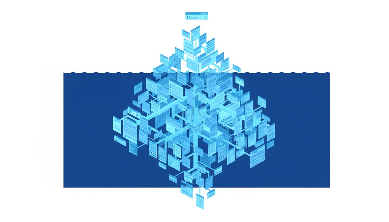
The most powerful feature in any piece of software is often the one you never find on your own. You stumble onto it years in, through a forum post or a frustrated colleague, and immediately think: why wasn’t this on the front page?
The answer isn’t incompetence. It’s strategy.
The Setup
In the mid-2010s, Microsoft’s Outlook had a feature called Focused Inbox, which used machine learning to separate your important email from everything else. It worked reasonably well. Microsoft was proud enough of it to announce it publicly. But for years before the official rollout, a version of the same capability existed inside Outlook under a different name, buried in a submenu that most users never opened.
Around the same time, power users discovered that Outlook’s rules engine, genuinely one of the most capable automation systems in any consumer email client, required navigating through Settings, then Manage Rules and Alerts, then a separate modal window that looked like it was designed in 2003. Many users never found it. Those who did spent years manually filtering newsletters into folders, unaware they could automate the entire thing in under three minutes.
Microsoft is not uniquely guilty here. Apple’s iOS has had a built-in document scanner since iOS 11, hidden inside the Notes app rather than sitting as a standalone tool. Adobe Photoshop’s batch processing function, which can automate weeks of repetitive export work, lives under File > Automate > Batch, a location you reach only if you already know what you’re looking for. Google Calendar has a “Goals” feature that automatically schedules recurring tasks around your existing appointments. Most users who would benefit from it have never seen it.
The pattern is too consistent to be accidental.
What Happened
The story of buried features is, at its core, a story about competing internal pressures that design gets blamed for.
Consider how features get prioritized at a large software company. A product manager owns a surface, say, the main toolbar or the home screen. Every team with a feature wants placement on that surface. The PM has finite real estate and a metric she’s accountable to, usually something like daily active usage or conversion rate on a specific funnel. A feature that helps existing users do their current job better does not move that metric in a visible way. A feature that brings in new users, or pushes existing users toward a higher subscription tier, does.
So the automation features, the power tools, the things that make software genuinely transformative for the people who use it every day, get demoted. Not because anyone decided they were unimportant. Because no single person on the org chart owns the metric that they would improve.
There’s a second force at work. Many of the best features are also the most dangerous to surface prominently. Outlook’s rules engine is powerful precisely because it can do a lot, which means it can also break things if misconfigured. Photoshop’s batch processing can overwrite hundreds of files. Google’s Goal scheduling can restructure your week in ways you didn’t intend. Product teams have a rational fear of support tickets and user complaints. Burying a feature is a form of liability management. If users have to work to find it, only the users motivated enough to use it correctly will find it.
This calculus is not entirely wrong. But it has a cost that rarely shows up on anyone’s dashboard.
Why It Matters
When powerful features are consistently hidden, two things happen.
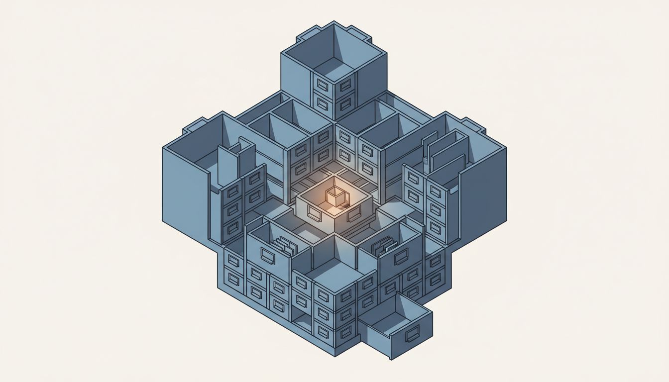
First, the majority of users operate the software at a fraction of its capability. They pay the same subscription price, derive less value, and eventually churn, not because the product failed to build what they needed, but because the product failed to show them it existed. The software isn’t too complicated for them. The interface assumed they’d never go looking.
Second, the users who do find buried features start to feel like insiders. There’s an entire genre of productivity content built around this: “The Hidden Google Docs Feature That Will Change How You Work.” These posts drive significant traffic because they’re genuinely useful, but the audience for them is self-selecting. It’s the people who were already motivated enough to search. Everyone else continues clicking through menus that were designed to move them toward the upgrade prompt, not toward the capability they actually need.
This dynamic has a compounding effect. Products that hide their best capabilities create a two-tier user base: the power users who know the shortcuts and the majority who don’t. The majority churns. The power users stay, but they’re also the users most likely to migrate the moment a competitor offers the same capability with better discoverability. The software company has built loyalty that’s a mile wide and an inch deep.
What We Can Learn
The honest lesson here cuts in two directions.
For companies building software: progressive disclosure, the design principle of showing simple options first and advanced options later, is sound. But there’s a difference between staging complexity and hiding value. When a feature is hidden because it helps users rather than metrics, that’s not a design decision. That’s a misaligned incentive structure that has colonized your product.
The fix isn’t to flatten every menu. It’s to build internal accountability around feature discoverability as a first-class metric, not an afterthought. Notion does this reasonably well: its slash command system puts nearly every feature one keystroke away, with no commitment required. Figma surfaces its most powerful capabilities through contextual menus that appear exactly when you need them. Neither company got there by accident. Both made explicit choices to measure whether users were finding the tools they needed, not just whether users were opening the app.
For users: the buried feature problem is also a reminder that software literacy compounds in ways that raw productivity does not. An hour spent exploring the settings of a tool you use daily will almost always return more than an hour spent working faster inside the defaults. The power user is often losing to someone with half the tools not because of talent, but because the other person found the three features that matter and stopped looking for more.
For anyone thinking about product strategy: the tension between what helps users and what moves metrics is real, and pretending otherwise is naive. But companies that consistently resolve that tension in favor of metrics eventually end up with software that users tolerate rather than value. The features you hide are a statement about who you think your product is actually for.