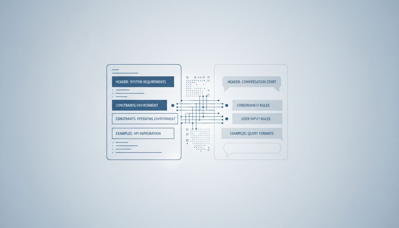
The most consequential product decisions don’t happen when users click something. They happen before users arrive, in the choices engineers make about what state the product is in when nobody’s looking. Default settings, pre-selected options, framing, and ordering don’t just influence behavior. At scale, they manufacture it.
This isn’t a cynical take. Some defaults are genuinely good for users. But the mechanism works the same whether the intent is benign or extractive, and understanding it changes how you read software.
1. The Default Is the Decision for Most People
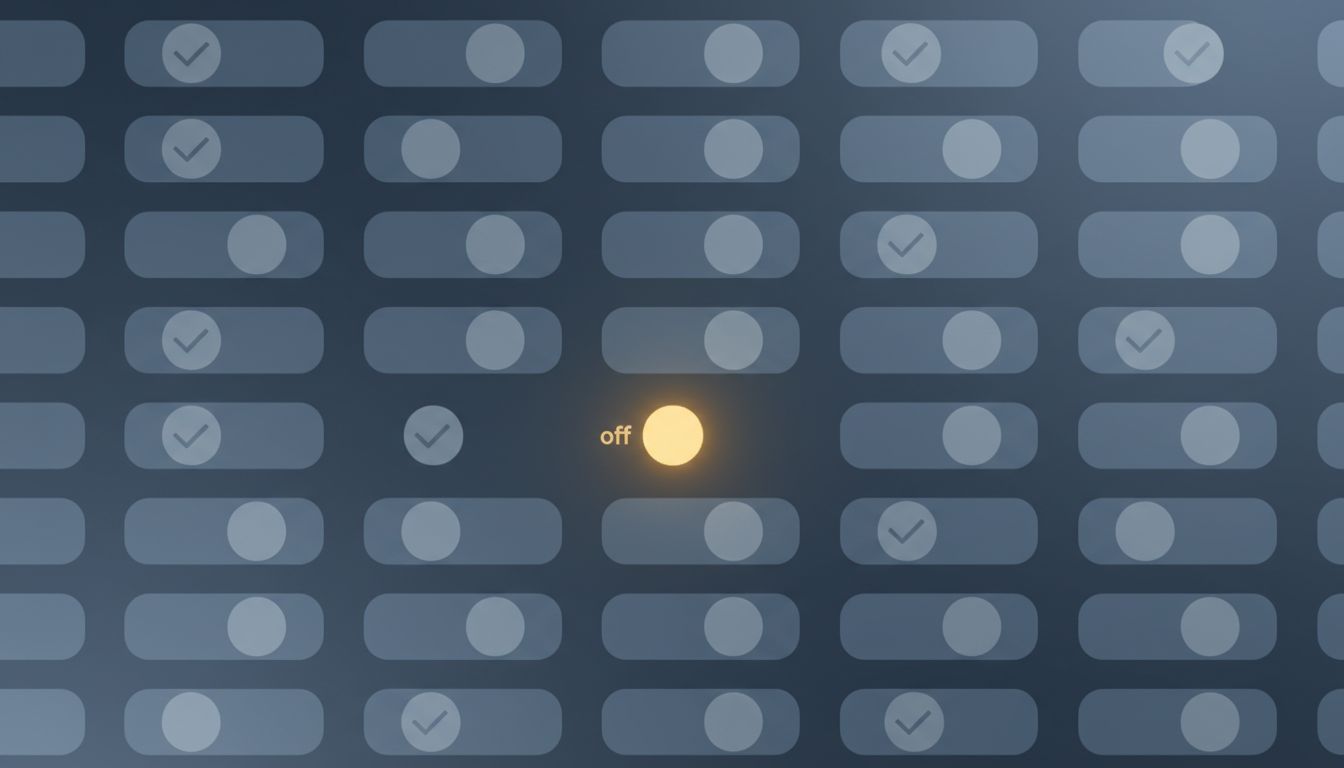
Behavioral economists have documented this pattern across dozens of domains: when you make an option the default, adoption rates climb steeply. The classic example is organ donation. Countries using opt-out frameworks (where you’re a donor unless you say otherwise) have donation rates above 90%. Countries using opt-in frameworks rarely break 20%. Same population, same underlying preferences, radically different outcomes.
Software works the same way. When a company pre-selects “receive marketing emails” during signup, most users don’t uncheck it. Not because they want the emails, but because unchecking requires a conscious decision that most people don’t make in the middle of a signup flow. Default settings are the most powerful product decision a tech company makes, and the companies that understand this build the default to serve their interests first.
2. Notification Defaults Are Optimized for Engagement, Not for You
Every major app ships with notifications turned on. This isn’t a coincidence born from good intentions. Notifications drive retention metrics, and retention metrics drive valuation. The rational move for a product team is to default to maximum noise and let users who care enough figure out how to quiet it.
The friction is asymmetric. Turning notifications on requires zero effort (it’s the default). Auditing and disabling them across a phone requires navigating nested menus in a dozen different apps. Most users never do it. The result is that notification behavior at scale reflects product team incentives far more than user preferences. When Apple introduced per-app notification summaries in iOS 15, third-party engagement numbers dropped noticeably for apps that had relied on high-frequency pinging. The preferences were there all along. The friction had just been burying them.

3. Pre-Checked Boxes Have a Long and Profitable History
The checkbox pre-selected by default is one of the oldest tricks in software design, and it’s still everywhere. Software installers bundle toolbars and browser extensions that users didn’t ask for. Subscription services auto-enroll users in annual plans when a free trial ends. Streaming platforms default to auto-play on the next episode. Cloud storage apps default to syncing your entire photo library.
Each individual instance seems minor. Cumulatively, they represent enormous revenue and data capture that wouldn’t exist if users had to make an affirmative choice. The FTC has taken action against companies that use pre-checked boxes to enroll users in paid services without clear consent, but enforcement is slow and the practice remains widespread. The asymmetry is baked in: the cost to the company of removing a pre-check is a drop in conversions; the cost to users is diffuse and rarely traced back to the box they didn’t uncheck.
4. Sorting Order Is a Form of Recommendation
When you open an e-commerce site and see products sorted by “relevance,” you’re seeing an algorithmic choice dressed as a neutral display. Relevance is defined by the platform, and that definition usually incorporates paid placement, margin, and inventory goals alongside actual user signals.
The same logic applies to search results, app stores, social feeds, and music recommendations. The item at the top of a list gets disproportionate attention and clicks, a dynamic called position bias that’s well-documented in information retrieval research. Spotify’s editorial playlists, Amazon’s “featured” products, the App Store’s search result ordering — all of these are default views that millions of users take at face value as neutral rankings. They are not neutral. They reflect negotiations, algorithms, and business relationships that users have no visibility into.
5. Privacy Settings Default to Maximum Data Collection
With few exceptions, software defaults to collecting everything and sharing broadly. Turning on location services, granting microphone access, enabling personalized ads — these are the factory settings. Users who want less exposure have to find the right menu and understand what each toggle actually does, which requires a level of technical literacy that companies are not incentivized to cultivate.
The EU’s GDPR and California’s CCPA introduced requirements that pushed companies toward explicit consent for certain data uses. The response from many companies was instructive: they designed consent interfaces (cookie banners, permission dialogs) that made “accept all” large, prominent, and easy, while making “manage preferences” small, buried, and tedious. The default behavior changed technically while the actual user behavior changed very little. This design pattern has a name in the research literature: dark patterns. It’s not a niche finding. Studies of major consent interfaces consistently show that accept-all rates drop sharply when the interface is designed neutrally, which tells you everything about why most companies don’t design it neutrally.
6. AI Products Are Now Inheriting All of This
The arrival of AI assistants and copilots adds new surface area for invisible defaults. Which sources does a retrieval-augmented system consult? What tone does a writing assistant default to? When a model hedges or expresses uncertainty, is that calibrated to reality or to liability? AI assistants are designed to express doubt, and it has almost nothing to do with honesty.
These systems don’t just have defaults — they have defaults that are harder to inspect than a checkbox. A pre-selected email opt-in is at least visible. The prior probabilities and RLHF training choices that make a language model more likely to recommend one product over another, or frame a topic a particular way, are buried in weights that no user can audit. The mechanism is the same as a pre-checked box, but the opacity is much greater. As these tools move into search, productivity software, and decision support, the defaults they carry will shape how hundreds of millions of people understand information.
7. The Fix Requires More Than Awareness
Knowing defaults exist doesn’t reliably neutralize them. That’s what makes the mechanism durable. Even people who understand choice architecture are subject to it, because the friction advantage still exists. You can know that a streaming service defaults to auto-play and still leave it on because turning it off requires a settings menu and a moment you haven’t gotten to.
Structural solutions work better than individual vigilance. Regulators in several jurisdictions are moving toward requiring privacy-protective defaults rather than allowing disclosure-plus-consent as a sufficient standard. Requiring that the default state of a product be the least invasive option, rather than the most profitable one, would shift outcomes at scale the same way opt-out organ donation shifts donation rates. The mechanism that created the problem is the same one that can fix it. Whether that fix happens through regulation, competition, or some future norm shift in product culture is genuinely uncertain. But the first step is being clear about what’s actually happening when software ships with its settings already chosen.