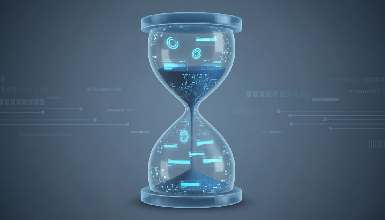
The loading spinner has become the universal symbol of digital patience. You see it when you open a banking app, when you refresh a social feed, when you pull up search results in an e-commerce checkout flow. Most users assume it means the servers are working hard. Some assume the app is poorly built. Almost nobody assumes it’s intentional.
It often is.
There is a body of practice inside product design, drawing on decades of behavioral research, that treats perceived speed as a variable to be tuned rather than maximized. The goal is not always to make things feel as fast as possible. Sometimes the goal is to make things feel appropriately fast, which is a meaningfully different target. And in a handful of cases, the goal is to make things feel slower, because faster would undermine the thing the product is actually trying to sell.
The Perception Gap That Engineers Don’t Talk About
Here is the foundational fact that drives all of this: humans are remarkably bad at estimating duration. We are good at comparing durations, and we are sensitive to whether an experience felt satisfying or frustrating, but our raw perception of elapsed time is malleable in ways that product teams have learned to exploit.
The clearest demonstration of this is what researchers call the “operational transparency” effect, studied extensively by Harvard Business School professor Ryan Buell and colleagues. Their work found that showing users the work being done on their behalf, even when that work takes longer, increases satisfaction. In one study, users preferred a travel search tool that displayed its algorithm working through options over a faster tool that just returned results. The slower-feeling experience earned higher trust scores.
The implication for product designers is profound and slightly uncomfortable: an instant result can feel cheap. A result that arrives after a visible process feels earned, considered, authoritative.
Why LinkedIn’s “Viewing Profiles” Indicator Changes Nothing and Everything
LinkedIn has built an entire layer of deliberate friction into its notification system. When you view someone’s profile, there is a pause, a moment where the app seems to be processing who has recently viewed you, before populating the list. The data almost certainly exists before the animation completes. LinkedIn’s servers are not slowly assembling this information in real time.
The delay serves a different function. It signals consequence. Viewing someone’s profile on LinkedIn carries social weight that viewing a product on Amazon does not. The brief load moment creates a beat, a moment where the user registers that this action has meaning. It separates the platform behaviorally from the casual scroll of other social networks and reinforces its professional positioning.
This is not accidental. Product teams at companies this size run continuous experiments on timing, animation duration, and sequencing. The choices that survive are the ones that serve engagement metrics and brand perception simultaneously.
The Checkout Illusion That E-Commerce Companies Rely On
Consider what happens when you complete a purchase on a well-designed e-commerce platform. There is almost always a processing screen, usually two to four seconds, sometimes accompanied by text like “Securing your payment” or “Confirming your order.” Payment processors like Stripe can complete a card authorization in well under a second in ordinary conditions. The screen is not waiting for the payment to clear.
It is doing something more valuable: it is giving the user a moment to feel the gravity of the transaction. Removing that pause, returning an instant confirmation, would not improve conversion. Internal testing at multiple companies has found it tends to increase anxiety and, in some cases, drives users to refresh or cancel, fearing something went wrong.
The processing screen is, in a real sense, a service to the user. But it is also a service to the business, because a user who feels the transaction was weighty and handled carefully is less likely to dispute it, less likely to experience buyer’s remorse, and more likely to return.
This connects to something similar happening in a very different part of the tech industry. Tech companies deliberately throttle their fastest servers and call it a product strategy when speed itself undermines the perception of value they are trying to create.
The Dangerous Version: Manufactured Waiting as Dark Pattern
Not all deliberate slowness serves the user. There is a version of this practice that is straightforwardly manipulative, and conflating the two would be a mistake.
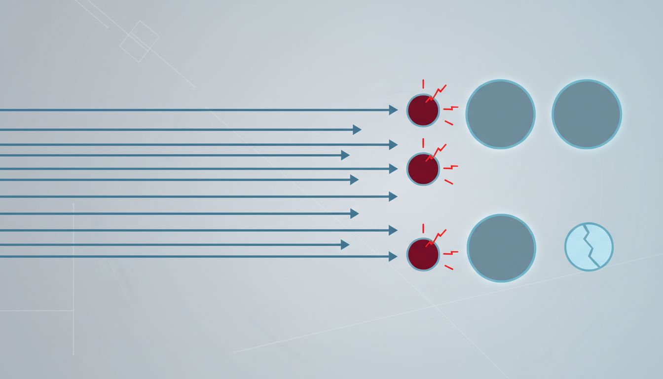
Subscription cancellation flows are the clearest example. Many streaming services and SaaS platforms have engineered cancellation pages that load noticeably slower than the rest of the app. The delay is not psychological service to the user. It is attrition by friction. Each additional second of waiting slightly increases the probability that a user will abandon the process and remain subscribed.
Routing users through slow-loading retention screens, presenting offers that require waiting for a “special deal” to generate, structuring the confirmation of cancellation to require multiple slow-loading steps: these are not operational transparency. They are toll booths placed specifically in the path of a user who has decided to leave.
The distinction matters because the same technique, intentional delay, can either align with user interest or work against it. The ethical version uses the pause to add meaning to a consequential moment. The manipulative version uses it to add friction to a decision the user has already made. Your app is running experiments on you right now and you never agreed to that explores how these optimization loops work at scale, often without any disclosure to users.
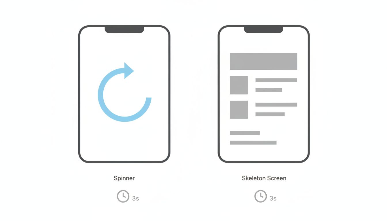
Skeleton Screens and the Art of Managing Impatience
Not all loading design involves making things slower. Some of it involves making speed feel faster by managing the experience of waiting rather than eliminating the wait itself.
Facebook’s skeleton screens, the gray placeholder layouts that appear before content loads, were among the first major implementations of a technique that is now universal. Research from Luke Wroblewski and subsequent work by UX practitioners consistently shows that users rate skeleton screens as feeling faster than equivalent-duration spinner animations, even when the actual load time is identical.
The skeleton screen works because it gives the eye somewhere to land. The brain begins interpreting structure before content arrives, which means the transition from loading to loaded feels like a completion rather than a replacement. The wait is the same. The experience of the wait is transformed.
This is the more benign face of deliberate loading design: engineering the perception of speed through intelligent sequencing, rather than manipulating duration. Progressive loading, lazy loading of below-the-fold content, and skeleton states are all in this category. They do not add time. They redistribute the experience of time.
When Speed Signals Desperation
There is one more pattern worth examining, and it operates at the brand level rather than the feature level. Certain categories of product have learned that instant results feel untrustworthy.
Legal research platforms, financial analytics tools, and medical reference apps frequently introduce brief processing states before surfacing results, not because the computation requires it, but because an instant answer to a complex question feels uncredible. If you ask a legal research tool whether a particular clause creates liability, and the answer appears before you have finished reading the question, the product has failed a believability test regardless of whether the answer is correct.
This is not a niche concern. Companies building AI-powered tools are navigating this problem right now as inference speeds increase. There is accumulating evidence from user research that faster AI responses, below a certain threshold, are perceived as less thoughtful, not more capable. A model that responds in under 200 milliseconds to a complex query may face the same trust deficit as the instant legal answer. The product may need to pace its output, even when it doesn’t technically need to.
This is a genuinely strange place for the industry to find itself, having spent thirty years optimizing for speed, now carefully considering whether some of that speed should be given back.
What This Means
The practice of deliberate loading is not a single phenomenon. It contains at least three distinct behaviors that tend to get conflated.
The first is psychological service: using a loading moment to mark a consequential action, build trust, or give an answer the weight it deserves. This generally aligns with user interest.
The second is perception management: using skeleton screens, progressive loading, and animation to make identical wait times feel shorter or more tolerable. This is neutral to positive for users and clearly positive for products.
The third is friction as attrition: engineering slowness specifically into the paths a user takes when trying to leave or disengage. This is adversarial and, in several jurisdictions, increasingly likely to attract regulatory attention.
The sophistication of the engineering underneath modern apps makes all three easy to implement and hard to distinguish from the outside. That opacity is, in itself, a product choice. Users cannot easily tell whether a four-second processing screen is serving them or extracting from them. Most will never think to ask.
The loading spinner was supposed to be a progress report. In the hands of a skilled product team, it has become something more like a stage direction.