
There is a number that gets buried in nearly every major app success story: seven. That is roughly how many years it takes a consumer app to reach what engineers call “interface stability,” the point at which the core user experience stops changing in ways users notice. Instagram took six years to add a second tab to its bottom navigation bar. Spotify spent eight years before settling on the five-icon layout it uses today. Apple’s Notes app, which looks like something a junior designer built in an afternoon, required over a decade of iteration before it stopped generating significant user complaints. The simplicity you see is not a starting point. It is a destination, and the road getting there is longer and stranger than most people assume.
This pattern appears counterintuitive until you look at the actual cost structure of software development. Successful apps are designed to be forgotten, and that is exactly how they keep you, but that forgettability is manufactured, not accidental. The engineering required to make something feel invisible is among the most expensive work in the industry.
The Iceberg Underneath the Button
Consider what sits beneath a single “Send” button in a messaging app. At minimum, you need message queuing, delivery confirmation, retry logic for failed sends, read receipts, encryption in transit, storage architecture that scales across millions of concurrent users, and notification infrastructure that works across at least two mobile operating systems. None of that is visible. None of it should be. But every piece required engineering decisions that took months to get right and years to prove out at scale.
A 2022 analysis by Stripe found that the average production codebase contains roughly 3,500 lines of infrastructure code for every 1,000 lines of user-facing feature code. That ratio tends to grow over time, not shrink. The more reliable and simple an app feels, the more hidden machinery is typically running underneath it.
This is why hiring estimates in early-stage companies so frequently miss. Founders budget for features. They forget to budget for the invisible layer that makes features trustworthy.
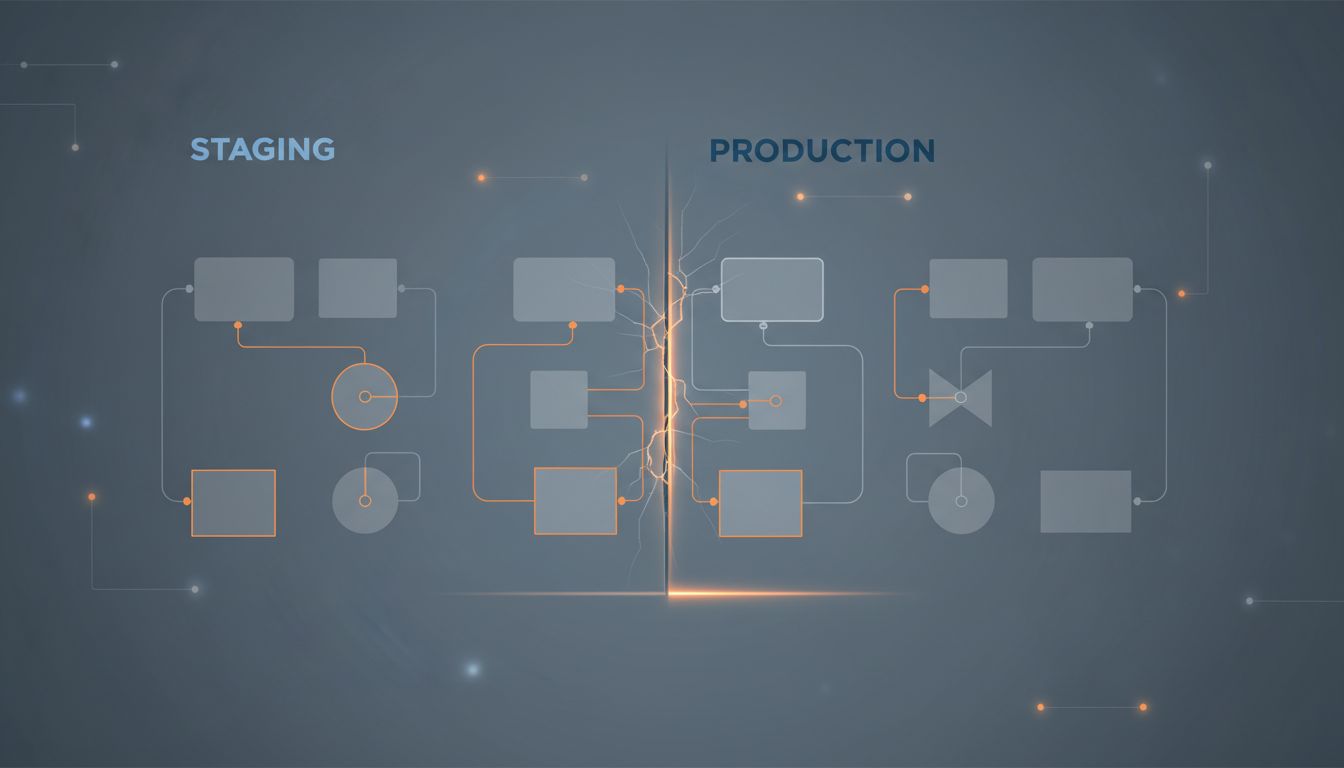
Why Simplicity Gets More Expensive Over Time
Here is the economic logic most product teams learn the hard way. Adding a feature costs a fixed amount. Removing a feature, or redesigning it to feel simpler, can cost several times more. You have to account for users who depend on the existing behavior, write migration paths for their data, communicate the change without triggering abandonment, and then monitor the fallout for months afterward.
Google famously took three years to remove the “View Image” button from search results after a licensing dispute with Getty Images. That button, a single clickable element, required a legal team, a product team, a user research program, and an engineering project to remove without breaking reverse-image-search workflows that millions of users had built their habits around.
This dynamic helps explain why tech companies deliberately slow down their fastest features, and the business logic is hiding in plain sight. Speed and simplicity are often in direct conflict during development. The temptation to ship quickly creates complexity debt that slows everything down later.
The Muscle Memory Problem
One underappreciated reason that simple apps take so long to build is that they have to survive contact with human habit. Users do not just use apps. They build muscle memory around them, and that memory is almost impossible to overwrite without causing measurable churn.
Snapchat learned this in 2018 when it redesigned its interface to separate content from friends. The logic was sound on paper. The execution was clean. User testing was positive. The rollout triggered a petition with over 1.2 million signatures and an estimated loss of 3 million daily active users in a single quarter. The app had been too simple, in the wrong direction.
This is the hidden variable in most app timelines. It is not that engineers are slow. It is that the human nervous system imposes a speed limit on how fast an interface can evolve. Successful apps learn to move at the pace of user adaptation, which is far slower than the pace of engineering capability.
This connects to a broader point about how the most productive teams structure their work. The most productive teams stopped using real-time collaboration tools and their output proves it, in part because asynchronous work better matches the tempo of careful, deliberate decision-making, the kind required when every UI change carries long-term consequences.
What the Timeline Actually Contains
Break down those seven years, and a consistent pattern emerges across successful consumer apps.
Years one and two are primarily feature discovery. Teams are learning what users actually want versus what they said they wanted. The interface during this period is often cluttered and inconsistent, not because engineers are careless, but because the product question has not been answered yet.
Years three and four are removal. This is where the real design work happens. Features get cut. Navigation gets consolidated. The app starts to look more intentional, but the underlying codebase is often messier than it was at launch because it has been retrofitted to accommodate changes that were not anticipated in the original architecture.
Years five through seven are stability and trust. The interface changes slow down. Infrastructure gets rebuilt to actually support the design that users have come to expect. Error rates drop. Load times become consistent. The app begins to feel simple because everything that made it feel complicated has been quietly removed or hidden behind layers of engineering.
The Competitive Advantage Hidden in Plain Sight
There is a strategic reason beyond user experience for why this long timeline matters. An app that has spent seven years removing complexity has accumulated something that cannot be replicated quickly: a tested, stable interface that new competitors cannot copy without going through the same process.
This is one reason why early-stage startups win not by knowing more than incumbents but by strategically knowing less. Incumbents with polished interfaces have years of scar tissue protecting them. New entrants have to discover the same hard lessons, usually on their own users.
Simplicity, in the end, is not a design philosophy. It is an artifact of survival. The apps that look effortless are the ones that made it through the full cycle of addition and subtraction, and had the runway to do it. That runway costs money, time, and a tolerance for looking unfinished for longer than most investors or users are comfortable with.
The blank screen and the single button are not where apps begin. They are where apps arrive, after years of work that never shows up in a changelog.