
The autoplay feature on Netflix wasn’t shipped because engineers forgot to add a pause. The unskippable ads on YouTube Premium upgrade flows weren’t an oversight from a tired product manager. The cookie consent banners that bury ‘Reject All’ behind three nested menus weren’t designed that way by accident. These are features that companies knew, through testing and user research, that people actively disliked. They shipped them anyway. Understanding why requires looking past the usual narrative of corporate incompetence and recognizing something more uncomfortable: deliberate friction is a product strategy, and it works.
The Difference Between Bad Design and Intentional Friction
Bad design happens when teams move fast, skip user research, or lack the resources to iterate. Intentional friction is different. It requires investment. You have to run the A/B tests, read the heat maps, watch the session recordings, and then override all of that data to ship the thing users hate. That’s not negligence. That’s a decision made by someone who weighed user experience against a business objective and chose the business objective.
The clearest signal that a hated feature is intentional rather than accidental is when it survives. Real usability failures get fixed. If a design mistake costs the company engagement, it gets patched in the next sprint. If a feature survives years of documented user complaints and negative press, the company is getting something valuable from it that outweighs the reputational cost.
LinkedIn’s notification system is a good example. The platform floods users with alerts for birthdays, job anniversaries, and post reactions from people they barely know. LinkedIn’s own research has almost certainly confirmed that users find this excessive. The notifications persist because they drive return visits, and return visits drive ad impressions. The friction users experience isn’t a cost to LinkedIn. It’s the mechanism that delivers value to LinkedIn’s actual customers, the advertisers.
Dark Patterns Are Just Friction With a Specific Target
A subset of intentional friction has a name in the design world: dark patterns. The term was coined by UX designer Harry Brignull around 2010 to describe interface tricks that benefit the company at the user’s expense. Roach motel designs make subscriptions easy to start and nearly impossible to cancel. Confirmshaming uses guilt-laden button copy (‘No thanks, I don’t want to save money’) to pressure users into opt-ins. Disguised ads are styled to look like organic content.
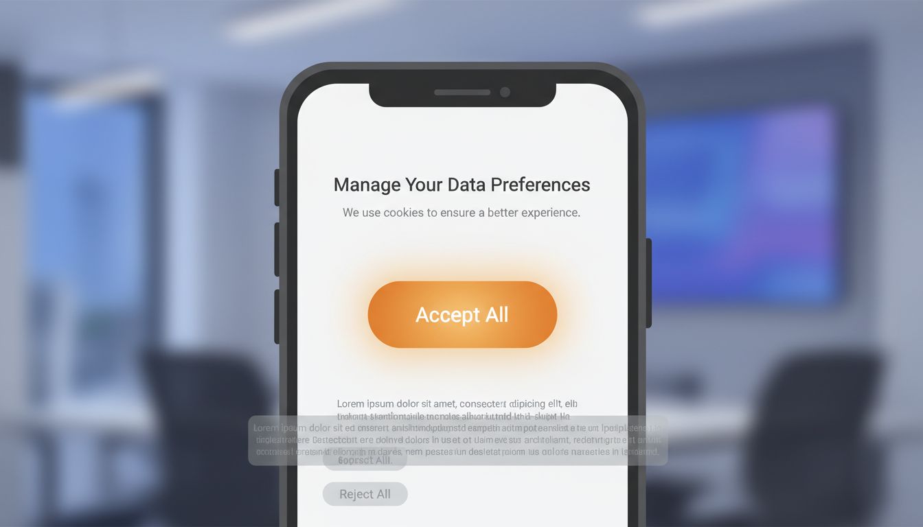
These aren’t edge cases from shady startups. The FTC has investigated and taken action against major companies for cancellation flows designed to exhaust users into giving up. The European Data Protection Board has specifically called out Meta’s consent management interface as a dark pattern, noting that the ‘Accept All’ button was visually prominent while ‘Manage Settings’ was grayed out and harder to locate.
The pattern that shows up repeatedly is this: companies invest heavily in reducing friction for actions that generate revenue (purchases, subscriptions, ad clicks) and invest equally in creating friction for actions that reduce revenue (cancellations, ad opt-outs, privacy controls). The asymmetry is the tell. When you see it, you’re looking at an intentional design.
The A/B Testing Cover Story
One reason intentional friction persists is that product teams can always point to A/B test results to justify it. The logic goes like this: we ran the test, the variant with the aggressive upsell prompt converted better, so we shipped it. What this framing obscures is that A/B tests measure short-term conversion on the specific metric the team chose to optimize. They rarely capture long-term user trust, word-of-mouth damage, or the gradual erosion of goodwill that comes from a platform that consistently treats users as conversion targets.
There’s a related dynamic where A/B testing frameworks themselves create pressure to ship more friction. When product managers are evaluated on metrics like daily active users, click-through rates, and conversion percentages, they will naturally run experiments that optimize for those numbers. Features that improve user experience in ways that don’t move short-term metrics won’t survive the testing process, even if they matter enormously to long-term retention.
This is structurally similar to the way tech companies design settings menus, where the default state always favors the platform’s business interests. A/B testing is the mechanism that manufactures the data to justify that default.
The Regulatory Arbitrage Play
Some hated features aren’t primarily about conversion optimization. They exist because companies are doing the math on regulatory risk and deciding that building a genuinely user-friendly interface would cost more than fighting regulators and paying fines.
Cookie consent is the clearest modern example. GDPR requires that consent for non-essential cookies be freely given, specific, and informed. The regulation also states that rejecting cookies must be as easy as accepting them. Companies looked at that requirement, calculated the likely revenue loss from a truly frictionless reject button, and decided to build dark pattern consent flows and absorb the enforcement risk. France’s CNIL fined Google 150 million euros and Facebook 60 million euros in January 2022 specifically for making the ‘Refuse all cookies’ option harder to access than the ‘Accept all’ option. Both companies had clearly made a deliberate choice.
This is regulatory arbitrage. You calculate the expected fine, discount it by the probability of enforcement, and compare that to the revenue you’d lose from compliant design. If the math favors non-compliance, some companies will build the non-compliant feature. This calculation is more common than people realize, and it explains why the same companies repeatedly pay fines for the same categories of behavior rather than fixing the underlying design.
Weaponized Defaults and Opt-Out Architecture
Not all intentional friction is aggressive. Some of it is quiet. The most effective form is a pre-checked box, a default setting, or an opt-out architecture that buries user control behind layers of menus. This friction is practically invisible because it doesn’t require active deception. It simply relies on the fact that most people don’t change defaults.
Windows 10’s installation flow defaulted users into extensive telemetry sharing. The detailed controls existed, but they required navigating to a separate ‘Custom’ install path that was visually de-emphasized compared to the ‘Express’ option. Microsoft knew most users would click Express. That was the point.
Amazon’s Subscribe & Save enrollment is another example. The friction is the absence of friction on the subscription option. The subscription is pre-selected on certain product pages, priced attractively, and easy to click through. Canceling that subscription requires navigating to a section of the site many users never visit. The enrollment flow is frictionless by design. The exit flow is not.
When Users Adapt and the Feature Becomes Invisible
There’s a longer game that companies are playing with intentional friction, and it’s the most interesting one. If users are exposed to a hated feature long enough, they normalize it. They stop noticing it. The friction that initially generated complaints becomes part of the landscape.
YouTube’s 5-second unskippable pre-roll ads were widely criticized when they launched. Ad-supported video streaming had barely existed before, and the format felt aggressive. Over time, users habituated. The 5-second count-down became ambient. Now YouTube is experimenting with unskippable 30-second ads on certain placements, and the baseline for comparison isn’t ‘no ads’ anymore. It’s the 5-second version users already accepted.
This normalization dynamic gives companies a clear playbook: introduce friction at a level that’s irritating but not so severe it triggers mass churn, wait for habituation, then expand. You can see the same pattern in how autoplay video moved from opt-in to opt-out to default-on across most major platforms over roughly five years. Each step was resisted. Each step eventually became normal.
What This Means
The companies building features their users hate are not confused about user preferences. In most cases they have better data on user behavior than any external critic could produce. The decision to ship friction is a business decision, made with full information, by people who’ve concluded that the feature serves the company even if it doesn’t serve the user.
This matters for a few practical reasons. First, complaining to customer support about these features accomplishes almost nothing, because the features aren’t there by mistake. Second, regulatory pressure is probably the most effective lever for changing them, which is why the cookie consent situation in Europe looks different from the one in the United States. Third, the features that survive years of user backlash are generating enough value for the company that no amount of negative press will remove them. The only reliable counter is either a regulatory mandate or a credible competitive threat from a platform that makes user experience a genuine differentiator.
That last option is rarer than it should be. Building genuinely user-respecting products takes discipline, and the short-term metrics almost always favor friction. But occasionally a company decides that trust is worth building, and the ones that do tend to develop loyalty their competitors can’t replicate through engagement tricks. The irony is that removing friction is itself a strategy. It’s just a harder one to justify in a quarterly review.