The Simple Version
When a useful feature is hard to find, it’s usually not because the designers forgot about it. It’s because making it easy to find would hurt the company’s revenue, user metrics, or both.
Why This Looks Like an Accident
There’s a comfortable explanation for buried features: incompetence. The company grew too fast, inherited too much technical debt, and nobody ever went back to clean things up. Design by committee produced chaos. Nobody is accountable for the whole product.
This explanation is sometimes true. But it’s not the explanation that fits the pattern.
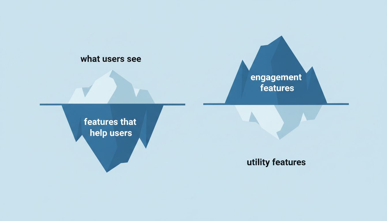
The pattern is this: features that genuinely solve problems for users, without generating engagement, revenue, or data for the company, are systematically harder to reach than features that do. That’s not random. Randomness doesn’t produce consistent directional bias.
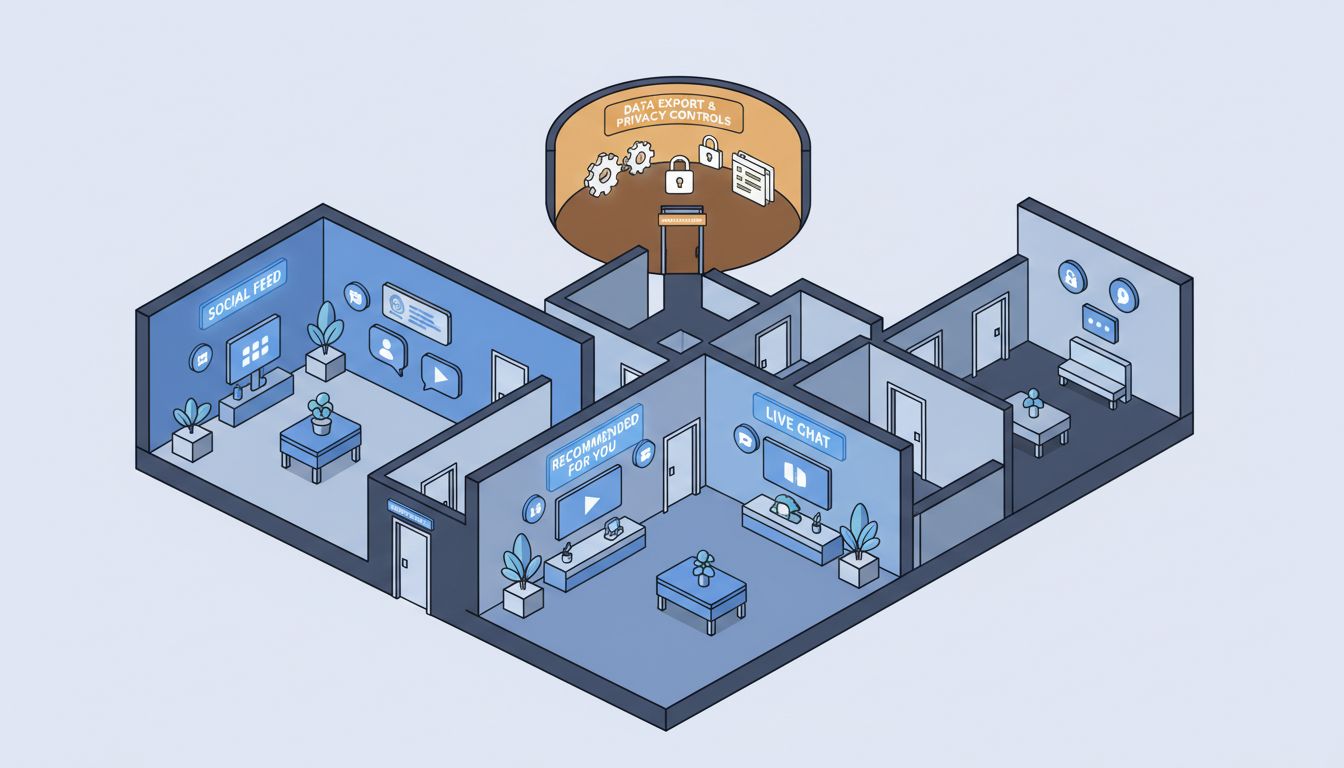
Consider Gmail’s “mute conversation” feature, which stops a thread from appearing in your inbox once you stop caring about it. It’s useful, it works well, and most Gmail users have never seen it. You access it by opening the three-dot menu inside a specific conversation. Meanwhile, the button that lets you add a label (a feature that trains Gmail’s categorization model on your behavior) sits one click away in the main toolbar. One feature helps Google. The other just helps you.
The Three Mechanisms
There are three distinct reasons a company might bury a feature, and they’re worth separating because they have different implications.
The first is engagement optimization. Most tech companies measure success through daily active users, session length, or some derivative of “time in app.” A feature that efficiently solves your problem and gets you out of the app is the enemy of this metric. Instagram’s “You’re all caught up” message, which appears after you’ve seen all recent posts, is a good example of a feature that fights its own company’s incentives. It was added under regulatory pressure and user backlash. The algorithm that surfaces older content to keep you scrolling was not buried. It was made invisible in a different way: it’s just called “your feed.”
The second is tier protection. Companies with paid plans deliberately make free-tier features harder to discover, not because the features don’t exist, but because discovery would undermine upgrade pressure. This is the same logic behind how pricing tiers are designed to push you toward the middle option: friction is a product decision, not a design failure. Notion’s offline mode existed for paid users long before it appeared anywhere in the free product’s documentation. The feature itself wasn’t the moat. The information about it was.
The third is the most underappreciated: feature surface area anxiety. When a company is selling to a mass market, a cluttered interface loses casual users faster than it gains power users. The economic value of the casual user, who pays the same subscription and barely touches the product, is often higher than the power user who extracts maximum value and creates maximum support overhead. Hiding advanced features is partly a revenue-per-feature-touch optimization. The user who never finds the export function never complains that the export function is slow.
The A/B Test That Exposes This
Here’s a useful thought experiment, though many companies have run actual versions of it. Take a genuinely useful feature buried in a settings submenu. Promote it to the main interface for a subset of users. Measure what happens.
In many cases, the feature gets used. Users are happier on surveys. Support tickets about the problem that feature solves drop. And somewhere in the metrics, a number the company cares about goes down. Session time falls. Upgrade rates soften because users are no longer frustrated enough to pay for a solution. Ad impressions per session decline.
This is the bind. The company now has evidence that the feature improves user satisfaction and evidence that promoting it hurts business performance. Most product teams, measured on business performance, will bury it again. This isn’t cynicism. It’s rational behavior inside a bad incentive structure. Software companies are running these experiments constantly, and you will almost never know the outcome.
What This Means for How You Use Software
The practical implication is worth taking seriously. The features that would make you most effective in a given app are disproportionately likely to be the ones the app doesn’t surface to you. This is not a small distortion. It means the version of a product you experience by default is not the version optimized for your productivity. It’s optimized for your continued presence.
The people who find these buried features tend to be the ones who read the full documentation, poke through every settings panel, or know someone who works at the company. That’s an information asymmetry that compounds over time. A user who discovers Gmail keyboard shortcuts on day one gets years of faster email. A user who discovers them three years in wonders why they waited.
The habit worth developing is to treat every app you use seriously as partially unexplored territory. Not because companies are hiding things out of malice, but because their incentives and yours point in different directions. The menu you’ve never opened is worth opening once.
The Companies That Get This Right
A few companies have structured incentives that actually align with feature discoverability. Figma’s command palette, accessible via a single keyboard shortcut, surfaces almost everything the application can do. Obsidian has a plugin architecture that lets power-user features exist without cluttering the main interface for everyone else. Both products have business models (team plans and one-time licenses, respectively) that benefit when users extract more value, not less.
This is the tell. When a company’s revenue goes up as users become more capable, it will surface features aggressively. When a company’s revenue depends on friction, frustration, or continued engagement regardless of outcomes, it will bury them. The interface is the business model made visible, if you know what you’re looking at.