
Open any major app for the first time and you’ll notice something odd: it feels almost too simple. Spotify doesn’t immediately show you its Crossfade slider or its local file sync. Notion doesn’t lead with its relational databases. Slack doesn’t advertise its slash commands on day one. These are genuinely powerful features, and they’re being deliberately kept out of your sight. This isn’t a design failure. It’s a strategy with a name, a rationale, and measurable results behind it.
This pattern connects to a broader playbook that tech companies run on their users with impressive consistency. As we’ve covered before, successful apps look simple because years of work were spent removing things, and the same discipline that produces a clean interface also produces a carefully staged feature reveal.
The Cognitive Overload Problem Is Real
The instinct to hide complexity isn’t arbitrary. Research in cognitive load theory, formalized by psychologist John Sweller in the 1980s, tells us that working memory has hard limits. When a new user lands in an unfamiliar product and sees forty options, something predictable happens: they leave. The dropout rate for apps during the first session can exceed 70 percent, and a cluttered interface is one of the most consistent predictors of early churn.
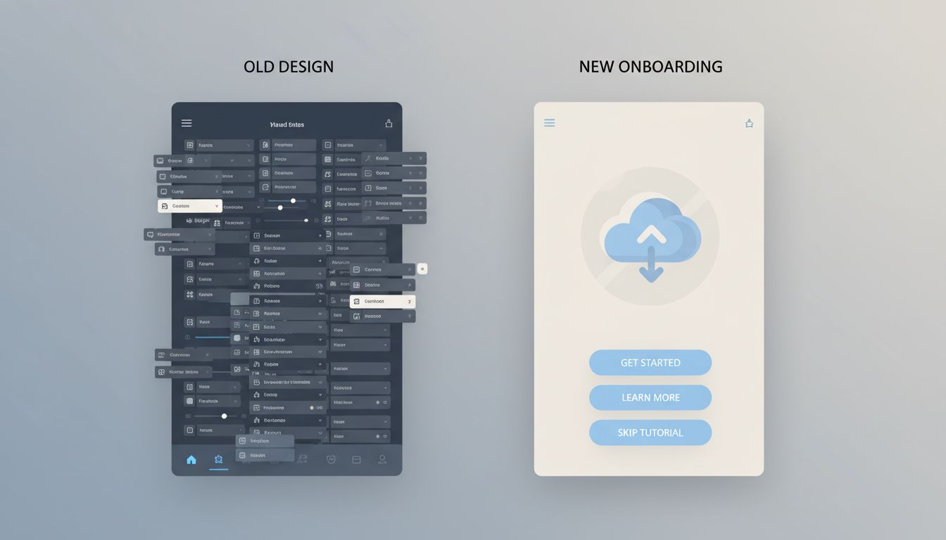
So product teams face a genuine tension. On one side, you have a feature set that took years and millions of dollars to build. On the other, you have a new user who needs to feel competent within minutes or they’ll delete the app entirely. The solution most companies land on is progressive disclosure, which is a design principle that surfaces features only when a user has demonstrated readiness for them.
The logic is straightforward: a feature that confuses a new user isn’t actually useful to that user yet. It’s noise. Hiding it isn’t deception. It’s pacing.
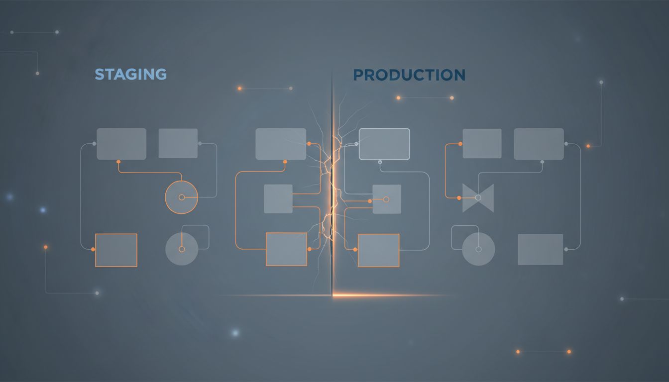
How the Feature Staging Actually Works
The mechanics vary by company, but the underlying structure is consistent. Most mature apps divide their feature set into three tiers.
The first tier is what new users see immediately: the single core action the app is built around. For Instagram in its early years, that was taking a photo. For Duolingo, it’s starting a lesson. For Figma, it’s creating a frame. Everything else is hidden behind menus, settings, or time-locked unlocks.
The second tier unlocks based on behavior signals. Once a Spotify user has created three playlists, the platform starts surfacing Collaborative Playlists. Once a Notion user has built a basic page, database views start appearing in the interface. These aren’t random. The product team has mapped which behaviors correlate with long-term retention, and they trigger feature reveals accordingly.
The third tier is often never surfaced automatically at all. These are power features that users have to discover themselves, through documentation, community forums, or word of mouth. This is intentional. The discovery moment creates a sense of reward and personal competence that a tutorial never could. When you stumble onto Figma’s component variants or Gmail’s filters after months of use, you feel like you’ve unlocked something. That feeling is engineered.
This connects to something deeper about how engagement is manufactured. Tech giants hide their most powerful retention tools so well that users call them conveniences, and the feature-staging model is one of the cleanest examples of that phenomenon in practice.
The Business Case Is Colder Than It Looks
Progressive disclosure sounds user-friendly, and in many ways it is. But it’s worth being precise about the incentives driving it, because they aren’t purely altruistic.
Feature discovery is a retention mechanism. Every time a user finds a new capability inside a product they already use, their switching cost increases. They’ve invested time learning the tool. They have data stored in it. They’ve built workflows around it. The more features they’ve discovered, the more expensive it becomes to leave.
This is why companies like Adobe, Salesforce, and Atlassian have built empires around feature depth rather than feature simplicity. The surface is clean enough to get you in. The hidden depth is what makes leaving feel irrational.

There’s also a product development angle worth noting. Companies often build features before they know exactly how to present them. The feature gets shipped, lives in a settings menu for a year, and gets promoted to the main interface only after usage data confirms it drives retention. This overlaps with the practice of building features they never launch on purpose, where the distinction between a hidden feature and an unreleased one is sometimes thinner than users realize.
When Hiding Features Becomes Manipulation
Not every instance of feature-hiding is benign, and it’s worth drawing the line clearly.
Progressive disclosure becomes a problem when the hidden features are the ones users need to protect themselves. Dark patterns in privacy settings are a well-documented example. The option to limit data sharing or opt out of targeted advertising is frequently buried four menus deep, while the option to enable everything is one tap from the home screen. This isn’t staging for cognitive load reduction. It’s staging for corporate benefit at user expense.
Similarly, paywalling discovery is a common tactic. A feature exists, works well, and is technically accessible, but the interface never shows it to free-tier users. They don’t know what they’re missing, which makes the upgrade pitch less effective but the retention lock stronger. You can’t leave a feature you never knew you had.
The tell is usually in whose benefit the hiding serves. Features hidden to reduce onboarding friction tend to get surfaced gradually and honestly. Features hidden to reduce user control or inflate perceived upgrade value tend to stay hidden indefinitely.
What Power Users Know That Beginners Don’t
If you’re using any major productivity tool, there’s a reasonable chance you’re running at 30 to 40 percent of its actual capability. The people around you who seem to get more out of the same tools aren’t necessarily more technically gifted. They’ve just spent time in the documentation, in community forums, or with someone who showed them the third tier.
This is the quiet asymmetry that feature-hiding creates at scale. Multitasking apps are engineered to make you switch tasks more often, and the same apps contain deep workflow features that could dramatically reduce that switching, features that most users will never find on their own.
The practical takeaway is simple: treat every tool you use seriously as an iceberg. What you can see is the product team’s best guess at what you’re ready for. What’s underneath is worth going to find deliberately, because nobody is coming to hand it to you.