
The intuition most people bring to product design goes something like this: if a feature is good, you promote it. If it makes money, you highlight it. This is wrong in ways that are instructive.
Some of the most profitable mechanics in modern tech are deliberately buried, obfuscated, or presented as something other than what they are. This isn’t conspiracy. It’s rational corporate behavior, once you understand the incentive structures involved.
1. Advertising Targeting Is the Product, and Showing It Clearly Would Destroy It
Facebook’s ad business generated over $130 billion in revenue in 2023. Almost none of that is visible to the people whose attention is being sold. Users see posts. Advertisers see targeting parameters that can slice audiences by income bracket, relationship status, and purchase intent inferred from behavior across the web.
The asymmetry is the point. If users fully understood the targeting capability, the political and regulatory pressure would be immense. Meta has faced this pressure anyway, which is why they’ve progressively hidden or removed the “why am I seeing this ad” transparency tools that briefly existed. Transparency in advertising is a compliance feature, not a product feature. It gets the minimum investment required to satisfy regulators.
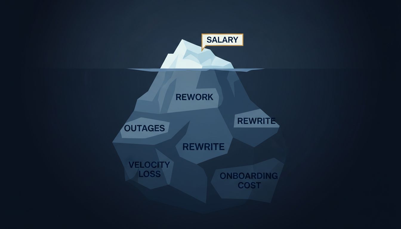
2. Free Tiers Are Engineered to Extract Upgrades From a Specific Minority
SaaS companies discovered that giving away software to the masses was a profitable strategy, provided the freemium conversion rate held. Dropbox, Spotify, and Slack all built their businesses on this model. The economics depend on the majority of users subsidizing the infrastructure while a small fraction of power users convert to paid plans.
What companies don’t advertise is how precisely engineered the free-tier limits are. Storage caps, seat limits, and feature restrictions aren’t set arbitrarily. They’re calibrated through A/B testing to identify the exact threshold where high-value users feel enough friction to pay, while casual users feel none. The “upgrade” prompt isn’t a sales message. It’s the culmination of a long behavioral profiling process.

3. Dark Patterns Are Revenue Lines With UX Names
The pre-checked subscription box at checkout. The cancellation flow that requires navigating four screens and a phone call. The “remind me later” button that actually re-enrolls you after 30 days. These are not UI failures. They are features with measurable revenue attribution.
Amazon’s “Subscribe & Save” default, Ticketmaster’s fee reveal at the final confirmation step, gym membership cancellation policies that require certified mail, these follow a consistent pattern: friction is added precisely where it serves company revenue and removed everywhere it serves the user. The asymmetry isn’t accidental design. A/B testing disciplines organizations to find and keep exactly this asymmetry. Bad UX that increases revenue survives. Good UX that reduces it doesn’t.
4. Algorithmic Feeds Are Optimized for Engagement, Not for Anything They Tell You They’re For
Platforms describe their recommendation algorithms as personalization engines built to surface content you’ll love. This is partially true and mostly misleading. The optimization target isn’t your satisfaction. It’s time-on-platform, which correlates with ad impressions, which correlates with revenue.
The distinction matters because these targets diverge. Content that provokes anxiety or outrage keeps people scrolling longer than content that makes them feel good and put the phone down. Internal research from Meta, surfaced during the 2021 Frances Haugen disclosures, showed the company was aware that Instagram damaged body image perceptions in teenage girls and chose not to materially change the product. The algorithm’s true optimization function is not a secret exactly, but it’s never stated plainly in any product documentation, investor call, or press release.
5. Default Settings Are Revenue Mechanisms Wearing the Clothes of Convenience
Google pays Apple roughly $15 to $20 billion per year to be the default search engine in Safari. That figure, reported in various antitrust proceedings, tells you everything about what defaults are worth. Users who never change defaults generate enormous revenue for whichever company captured the default position.
The same logic applies inside products. Microsoft’s default to storing documents in OneDrive, Google’s auto-enrollment in services during account setup, the pre-selected “yes” to marketing emails at checkout, these are all revenue features that look like settings. Companies fight bitterly in regulatory proceedings to preserve default positions because the financial stakes are concrete and large. The user’s perception is that they’re looking at a neutral starting point. They are looking at a negotiated commercial arrangement.
6. Data Brokerage Runs Beneath Virtually Every Free Consumer App
The data brokerage industry generates tens of billions of dollars annually. A meaningful share of that revenue traces back to apps that appear to be simple utilities. Flashlight apps, weather apps, period trackers, and step counters have all been documented collecting and selling location data, health data, and behavioral data to brokers who aggregate and resell it to advertisers, insurers, and hedge funds.
None of this appears in the primary product description. The app is presented as the product. The data collection is mentioned in a privacy policy written to be unread. This is not unique to small developers. Major platforms operate similar parallel revenue streams. The core service is the front end. The data pipeline is the business.
7. Switching Costs Are Deliberately Engineered Into Products From Day One
Salesforce, Oracle, and SAP built dominant market positions not primarily through superior functionality, but through deep integration with customer data and workflows. Once an organization runs its sales pipeline, customer records, or supply chain through one of these platforms for several years, migration costs become prohibitive. That’s not a bug. It’s the product.
This pattern appears at consumer scale too. Apple’s iMessage lock-in, the friction around exporting social media contacts, Google’s historical resistance to making Gmail data portable, all represent deliberate choices to make leaving expensive. As we’ve covered in the economics of deliberate API difficulty, technical friction is often corporate strategy wearing a technical costume. The profitability of switching costs doesn’t appear in any feature announcement. It appears in retention metrics and renewal rates that only analysts see.