
The Interface Is the Business Model
There is a straightforward reason your phone is hard to put down, and it has nothing to do with the quality of the content. The major platforms, Facebook, YouTube, TikTok, Instagram, have built interfaces specifically calibrated to defeat the part of your brain that decides when to stop. This is not a side effect. It is the core product decision, and it flows directly from a business model that sells your attention to advertisers by the second.
The term “dark pattern” was coined by UX designer Harry Brignull in 2010 to describe interface choices that manipulate users into actions they didn’t intend, buying something, signing up for something, staying longer than they meant to. The original context was e-commerce trickery: hidden fees surfacing at checkout, pre-ticked subscription boxes, cancellation flows designed to exhaust you into giving up. But the concept has since expanded to cover something more pervasive and more consequential: the entire architecture of attention-harvesting platforms.
Variable Rewards and the Slot Machine That Lives in Your Pocket
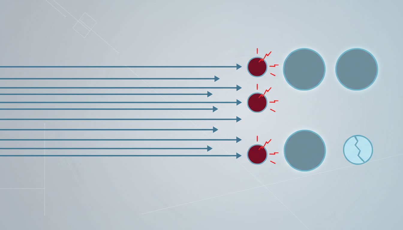
BF Skinner established in mid-century psychology research that variable reward schedules, rewards that arrive unpredictably rather than reliably, produce the most compulsive behavior in animals. The casinos figured this out decades before Silicon Valley. The slot machine doesn’t pay on every pull; it pays sometimes, and that uncertainty is precisely what keeps players seated.
Infinite scroll applies the same mechanic to a social feed. The original pagination model of the web, page 1, page 2, page 3, imposed natural stopping points. You reached the bottom of a page and had to make an active choice to continue. Infinite scroll eliminated that choice. Aza Raskin, who invented the feature while working on Firefox’s mobile browser, has publicly stated that he regrets it. His estimate is that infinite scroll costs humanity roughly 200,000 hours of productive time every day, a number impossible to verify precisely but directionally credible given the scale of engagement data platforms routinely cite.
Autoplay follows the same logic from a different angle. Netflix autoloads the next episode with a countdown timer that defaults to “yes.” YouTube queues the next video before the current one ends. The burden is placed on the user to actively stop, not on the platform to actively invite continuation. This is what behavioral economists call “opt-out architecture,” and when the default is “keep watching,” most people will keep watching.
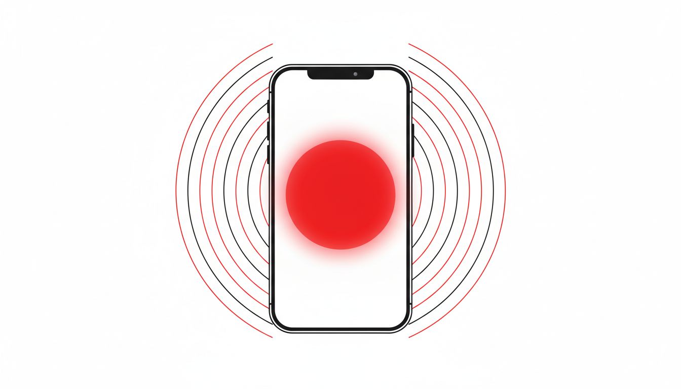
Notification design completes the loop. Platforms send notifications not when something genuinely important has happened, but when their models predict you are likely to re-engage. The red badge on an app icon is not informational. It is a trigger, engineered to produce anxiety that only resolves when you open the app.
The Teams That Build This Know Exactly What They Are Doing
This is not accidental complexity or the unintended consequence of building at scale. Internal documents and testimony from former employees at Facebook and Google have made the intentions explicit. Frances Haugen’s 2021 disclosures to the Wall Street Journal and Congress included internal research showing that Facebook’s own teams had identified engagement-maximizing features as harmful to a significant portion of users, particularly teenagers, and proceeded with them anyway because the engagement gains outweighed the reputational risk.
YouTube’s recommendation algorithm, as former product manager Guillaume Chaslot documented after leaving the company, was optimized for watch time, full stop. The downstream effect was that the algorithm learned that emotionally extreme content, outrage, fear, conspiratorial thinking, kept people watching longer than moderate content. The algorithm wasn’t designed to radicalize users. It was designed to maximize watch time, and radicalization was what fell out of that objective.
This is the design philosophy that Big Tech refined around consent as well: the goal is never to give users what they asked for. The goal is to give users what keeps them engaged, and then construct an interface that makes those two things feel identical.
The Regulation Question That Never Gets Resolved
European regulators have made more progress on this than American ones. The EU’s Digital Services Act, which came into force in 2024 for large platforms, requires that platforms offer users recommendation systems not based on profiling, meaning a chronological feed must be available as an option. The FTC has been studying dark patterns in e-commerce and subscription services, producing a 2022 report identifying specific manipulative design practices, but its enforcement authority over social platforms on attention grounds remains limited.
The fundamental problem is that most of these design choices are legal. There is no law against making scroll infinite. There is no law against autoplaying content. There is no law against engineering notification timing to maximize re-engagement. The harm is real and the intent is documented, but the legal category that would address it doesn’t exist yet.
Meanwhile, the platforms have become skilled at offering the appearance of user control without the substance of it. Screen time dashboards give you data about how long you spent on an app. They do not change the underlying design that produced that time. Offering you a graph of your compulsion is not the same as reducing it.
The Point Is Not to Quit Your Phone
The usual conclusion to this kind of analysis is a call to digital minimalism: delete the apps, reclaim your time, buy a dumb phone. That advice is fine as far as it goes, and it goes about as far as telling someone to buy better cookware as a response to the processed food industry. Individual choices matter at the margin, but they don’t restructure the incentive.
What actually matters is recognizing that the features you find hardest to resist are the ones that received the most engineering attention. The friction you feel when you try to stop is not a personal failing. It is the product working as designed. Understanding that doesn’t automatically change your behavior, but it does change what question you’re asking. The right question isn’t “why can’t I put my phone down.” It’s “what would these platforms look like if they were optimized for something other than keeping me on them.”
The answer to that question would look radically different from what we have now, and the companies that built what we have now know that better than anyone.