When Jony Ive famously declared that Apple’s original iMac would come in Bondi Blue, he wasn’t making an aesthetic choice—he was declaring psychological warfare. The color, borrowed from the translucent waters of an Australian beach, was designed to make computing feel approachable, friendly, organic. It worked so well that twenty-five years later, tech companies spend millions reverse-engineering the emotional triggers hidden in their competitors’ color palettes.
The technology industry’s relationship with color runs far deeper than surface-level branding decisions, much like how programming languages from the 1970s continue to power today’s most advanced systems—the psychological foundations laid decades ago still dictate how we experience technology today.
The Neuroscience of Digital Trust
Every tech giant’s signature color choice stems from the same psychological principle: colors trigger measurable neurological responses that directly impact user behavior. Facebook’s blue wasn’t chosen because Mark Zuckerberg liked it—though his red-green colorblindness certainly influenced the decision. Blue activates the prefrontal cortex in ways that promote trust and reliability, crucial for a platform asking users to share personal information.
Google’s rainbow palette serves a different psychological function entirely. The multicolored logo signals creativity and playfulness, but more importantly, it suggests comprehensive capability—a visual metaphor for organizing “all the world’s information.” Each color represents a different facet of human knowledge, a subtle but powerful message that Google contains multitudes.
The data backs this up. A/B testing at major tech companies consistently shows that color changes can move conversion rates by 10-15%. Amazon’s orange “Add to Cart” button wasn’t chosen randomly—orange combines red’s urgency with yellow’s optimism, creating what psychologists call “confident impulse.” When Amazon tested 40 different button colors, orange consistently outperformed alternatives in driving purchases.
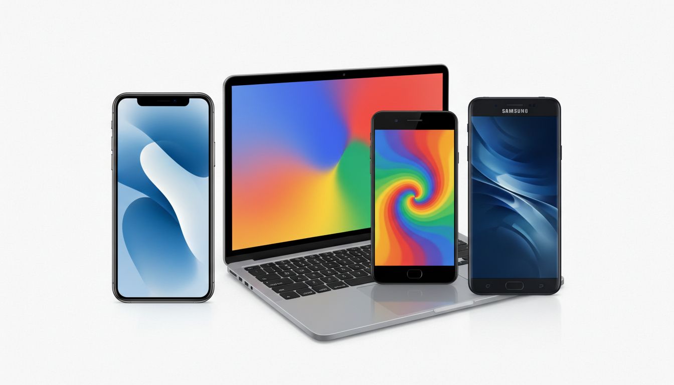
The White Space Wars
Apple’s embrace of white represents perhaps the most sophisticated color psychology in tech. White isn’t technically a color—it’s the presence of all colors, which allows Apple products to serve as neutral canvases for users’ lives. But the psychological effect goes deeper. White space triggers what researchers call “processing fluency”—the brain interprets simplicity as premium quality.
This explains why every major tech company has moved toward minimalist, white-heavy interfaces over the past decade. Google’s Material Design, Microsoft’s Fluent Design, even Facebook’s 2019 redesign—all prioritize white space not for aesthetic reasons, but because cognitive load studies show that white backgrounds improve task completion rates by up to 25%.
The trend has created what industry insiders call “the beige computer problem” in reverse. Where 1990s PCs were uniformly beige to blend into office environments, today’s devices are uniformly white to blend into lifestyle aspirations. The psychological message has shifted from “this is a tool” to “this is an extension of you.”
Green: The New Gold
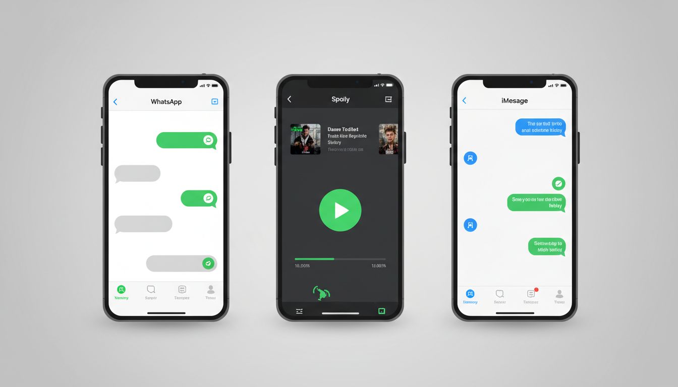
The most interesting color war happening today centers on green. WhatsApp’s green established the color as synonymous with private messaging, but Apple’s decision to make iPhone-to-iPhone messages green (while keeping SMS blue) represents a masterclass in behavioral psychology. The color coding creates in-group/out-group dynamics that subtly pressure Android users to switch platforms.
The strategy works because green triggers associations with growth, harmony, and exclusivity in Western cultures. When iPhone users see green bubbles in their message threads, they’re not just seeing a different color—they’re experiencing a psychological nudge toward platform loyalty.
Spotify’s green serves a different psychological function. In music streaming, green signals “go”—the permission to play, to move, to feel. It’s no coincidence that Spotify’s green is almost identical to the “play” button green that’s been standard in media players for decades. The color choice taps into decades of conditioned responses.
The Dark Mode Psychology Shift
The industry-wide adoption of dark mode represents the most significant color psychology shift in a decade. Initially justified for battery life and eye strain, dark interfaces actually trigger different psychological states than their light counterparts. Dark backgrounds activate what psychologists call “exploration mode”—users become more willing to browse, discover, and engage with content for longer periods.
Netflix pioneered this understanding. Their black interface isn’t just about making content pop—it’s about creating a theater-like psychological state that promotes binge-watching. The dark background literally makes everything else disappear, focusing attention entirely on content consumption.
Apple’s introduction of system-wide dark mode in iOS 13 wasn’t following a trend—it was acknowledging that user behavior had fundamentally shifted toward longer, more immersive device interactions. The company’s internal studies showed that dark mode users spend 23% more time in apps, validating the psychological principle at massive scale.
The Next Frontier: Cultural Color Coding
As tech companies expand globally, color psychology becomes infinitely more complex. Red signals luck and prosperity in Chinese markets but danger and warning in Western ones. The same blue that builds trust in Silicon Valley can signal coldness in Latin American cultures.
This cultural complexity explains why global tech products increasingly rely on dynamic color systems—interfaces that adapt not just to user preferences, but to cultural contexts. It’s a recognition that color psychology isn’t universal, and that truly global products need to speak multiple psychological languages.
The companies that crack this code won’t just build better interfaces—they’ll build deeper emotional connections across cultural boundaries. In a world where technology increasingly mediates human experience, the psychology of color isn’t just about making things look good. It’s about making users feel understood.