
The Engagement Trap
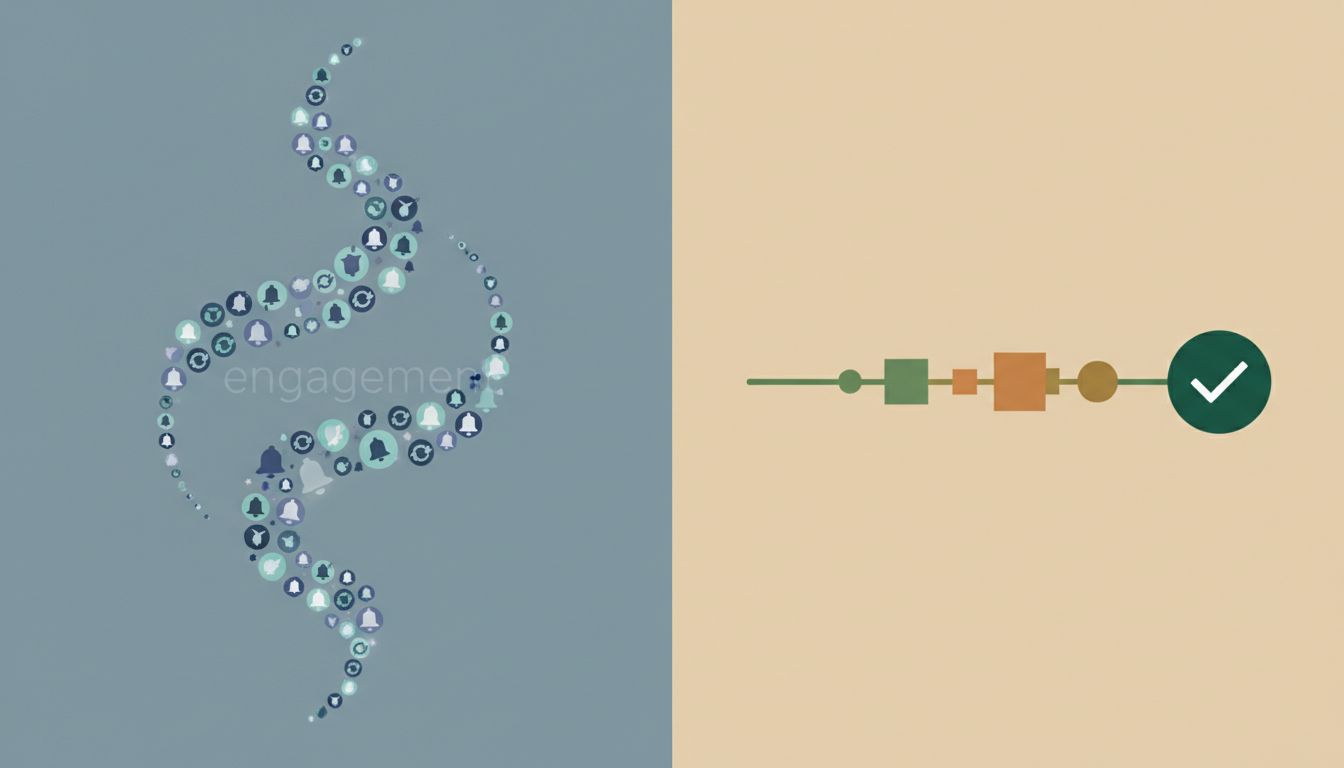
The standard story about apps goes like this: more usage means more value, and more value means more revenue. Social platforms obsess over daily active users. Games are engineered for compulsion loops. Notification systems are tuned to pull you back as often as possible. The entire vocabulary of the attention economy treats time-on-app as the fundamental unit of success.
But look at the apps that have built the most durable loyalty and, often, the most reliable revenue, and a different pattern emerges. The tools people trust with genuinely important tasks — their finances, their health, their work — are frequently designed around the opposite principle. Get in, solve the problem, get out. The goal isn’t your attention. It’s your confidence.
This isn’t philanthropy. It’s a calculated product strategy, and understanding it clarifies a lot about why some software categories thrive while others churn endlessly through users who never quite commit.
What “Designed to Be Used Less” Actually Means
There’s a distinction worth drawing carefully here. Designing for less usage doesn’t mean designing a worse product. It means aligning the product’s success metric with the user’s actual goal rather than with a proxy metric that’s easier to measure.
Consider password managers. The category is filled with apps that have extraordinarily high retention and strong word-of-mouth, despite the fact that most users interact with them only in brief, transactional moments. You open the app for ten seconds, autofill a credential, and move on. Nobody is spending forty-five minutes browsing their password vault. The value is entirely in the frictionlessness of those ten-second interactions, repeated hundreds of times over years. 1Password and Bitwarden don’t need engagement loops. They need to be invisible and reliable.
Or consider budgeting software. YNAB (You Need a Budget) has built a genuinely cult-like following with software that, if it’s working properly, you use for maybe twenty minutes a week. The company’s own marketing makes this explicit: the goal is financial clarity, not financial anxiety, and chronic app-checking is a symptom of the latter. Users who check their budget constantly are usually stressed. Users who check it briefly and feel resolved are the ones who renew and refer friends.
The Trust Economy
What these apps are actually optimizing for is a feeling that’s hard to A/B test: resolution. The sense that a task is genuinely complete, not just temporarily handled.
This is the core problem with engagement-maximizing design. When an app is built to pull you back, it implicitly signals that the job isn’t done. The notification that says “You haven’t checked your goals today” is also saying “Your goals aren’t settled.” The streak mechanic that makes you feel anxious if you miss a day is creating a psychological debt that competes with the value the app was supposedly delivering.
Apps designed for less usage achieve the opposite. They create what you might call cognitive closure. The mental file on that task gets marked done. And that feeling is incredibly sticky. People don’t abandon tools that make them feel competent and resolved. They abandon tools that make them feel like they’re falling behind.
This is part of why the productivity software market fragments so persistently. Many productivity apps are implicitly designed to make you feel like you need to use them more. Overloaded dashboards, ever-growing task backlogs, reminder systems that compound rather than resolve. Power users eventually stop depending on the apps themselves and build systems around them, precisely because the apps never deliver the resolution they promise.
The Business Case Is Clearer Than It Looks
Skeptics will point out that engagement metrics are what most investors and acquirers actually measure, so the incentives cut against restrained design. This is true in the short term and wrong in the longer arc.
Apps that over-extract attention pay a compounding tax. Users who feel manipulated eventually leave, or stay but with degraded trust and lower willingness to pay. The brands most associated with dark patterns, those that move notification sliders to “on” by default, make cancellation deliberately obscure, or manufacture urgency, generate consistent customer service overhead and negative word-of-mouth that quietly erodes their growth economics.
Contrast this with the subscription retention rates in categories built around resolution. Password managers have some of the highest renewal rates in consumer software. Tax preparation tools used once a year have customer relationships that span decades. Calm, the meditation app, explicitly built its brand around reducing anxiety, which meant resisting the feature additions and engagement loops that would have made it look more like a traditional app and less like a tool. The company reached a valuation above a billion dollars on a product that most users open for ten minutes, once a day, with the express goal of then closing it and going to sleep.
The long-run business logic is that trust compounds. A user who feels an app genuinely serves their interests and stays out of the way is a user who recommends it, pays for upgrades without much deliberation, and doesn’t leave when a competitor offers a free tier. That’s a more durable asset than raw engagement numbers, even if it’s harder to put in a deck.
What This Means for How You Evaluate Apps
The practical implication isn’t complicated. When you’re choosing tools for anything that actually matters, the engagement design of the app is a meaningful signal about whose interests the product is serving.
An app that makes you feel resolved and then leaves you alone is making a bet on your loyalty. An app that manufactures reasons to return is making a bet on your inattention. These aren’t the same product, even when they’re solving nominally the same problem.
The irony is that the apps doing the most genuinely useful work in people’s lives are often the ones they think about the least. They disappear into the background of a working life, surfacing only when needed, completing the task, and getting out of the way. That invisibility isn’t a design failure. For the best tools, it’s the whole point.