The Logic of Artificial Limits
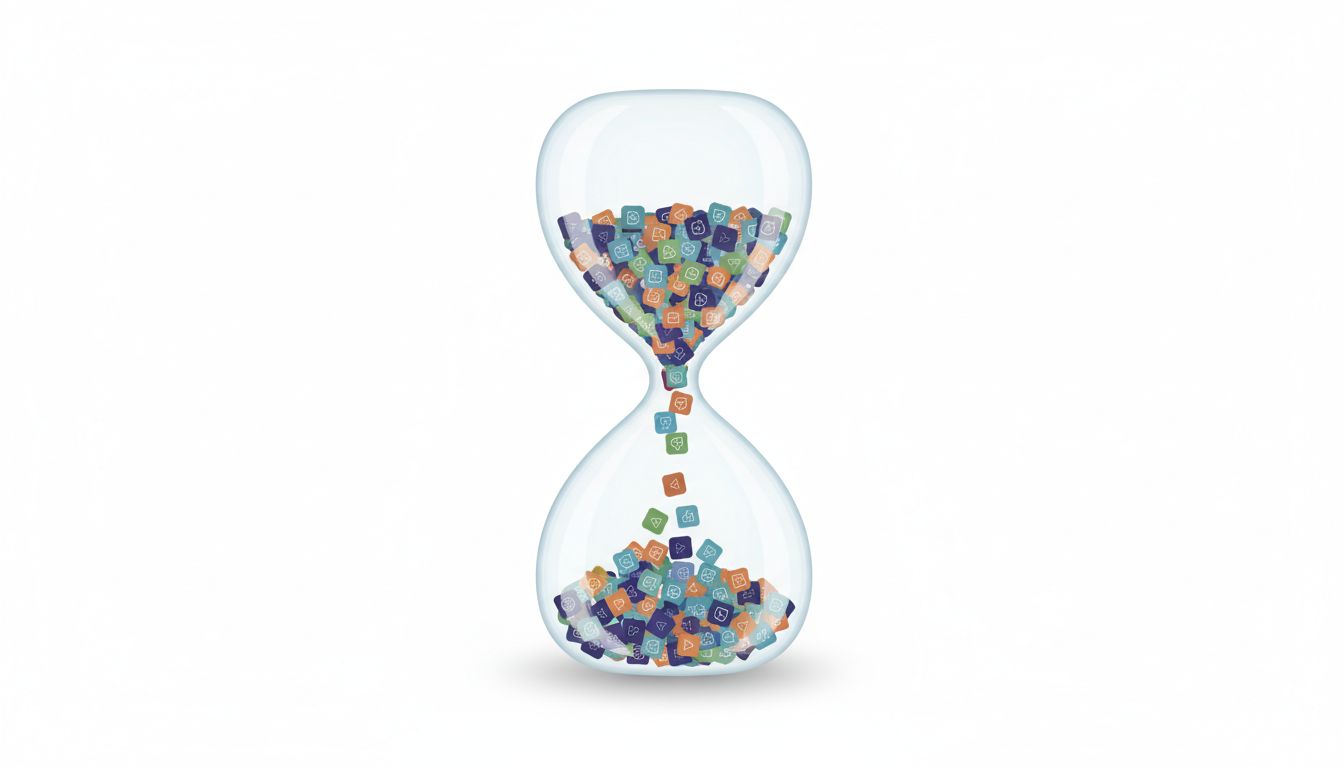
The conventional wisdom in consumer app design has always pointed toward more. More features, more content, more time-on-app. Engagement was the metric that drove everything, and engagement meant duration. An app you spent three hours inside was better than one you spent twenty minutes with, almost by definition.
That assumption is breaking down. A distinct class of apps, among them some of the most commercially successful of the past decade, now actively constrain how much you can use them. Not by accident, not as a cost-cutting workaround, but as a core design decision. The constraint is the product.
Understanding why requires separating two things that get conflated: engagement as time spent, and engagement as value delivered. For a long time, app developers optimized for the former and assumed the latter would follow. Some of the most interesting design thinking happening right now is built on the premise that they have almost nothing to do with each other.
Duolingo Didn’t Invent This, But It Proved It Works
Duolingo is the clearest case study. The app gives you a daily streak, pushes you toward a lesson that takes roughly five minutes, and then gently discourages you from doing much more than two or three sessions in a day. There are no meaningful rewards for sitting inside Duolingo for four hours. The XP system encourages consistency over binging.
This is deliberate. Language acquisition research consistently shows that spaced repetition and distributed practice outperform massed practice. Learning Spanish for thirty minutes a day for thirty days produces better retention than learning it for fifteen hours over a single weekend. Duolingo’s design constraint isn’t arbitrary. It’s aligned with how the underlying task actually works.
But the business logic runs deeper than pedagogy. An app you open every day for five years is more valuable than an app you use obsessively for three weeks and then abandon. Daily active users compound. Churn is expensive. The limit creates the habit, and the habit creates retention. Duolingo’s streak mechanic, which punishes you for missing a day rather than rewarding you for using the app more in a single sitting, is one of the most effective retention mechanisms in consumer software.

Wordle’s Extreme Version of the Same Idea
Wordle took the principle to its logical extreme. One puzzle per day. No exceptions, no way to play more, no unlockable content. When the New York Times acquired it in early 2022, the reported price was in the low seven figures. For an app that, structurally, offers less than five minutes of engagement per day.
The genius wasn’t the puzzle format. It was the artificial scarcity that made sharing feel meaningful. Because everyone was working with the same word on the same day, the shared experience had social weight. If you could replay indefinitely, that weight disappears. The limit is what made the product culturally sticky in a way that no amount of additional content could have manufactured.
This is the counterintuitive part: limits create urgency, and urgency creates attention. An app with infinite content competes with every other app with infinite content, and they all compete with boredom, and boredom sometimes wins. An app that gives you one thing and then closes creates a different relationship with the user. It becomes a ritual rather than a resource.
The Subscription Economy Is Making This More Attractive
There’s a structural reason more apps are moving this way, and it connects to how subscription businesses actually work. When you charge monthly, your incentive is retention, not session length. A user who opens your app briefly every day for three years is worth more than a user who burns through everything in a month and cancels.
This flips the optimization target. Instead of maximizing time-in-app, you want to maximize days-between-churn. Those require different designs. Tech companies report revenue differently because their product is fundamentally different from every other product, and the SaaS revenue model rewards durability over intensity.
Meditation apps understood this early. Calm and Headspace both push you toward short daily sessions rather than long continuous use. Headspace’s core product is a ten-minute daily meditation. The message is consistent: do less, but do it every day. That design constraint reduces churn because it makes the app easy to maintain as a habit even when your schedule gets chaotic. A four-hour daily requirement will get dropped at the first busy week. A ten-minute requirement survives.
When Limits Fail
This doesn’t work for every app, and it’s worth being precise about why. The strategy depends on two conditions: the underlying task benefits from distributed practice rather than binging, and the user has a reason to return tomorrow that isn’t just manufactured anxiety.
Netflix could not do this. The value proposition of a streaming service is content depth and availability. Artificial limits would just send subscribers to a competitor. Spotify can’t do it either, for the same reason. The apps that benefit from designed constraints tend to be ones where the core task is a skill or habit, not consumption.
There’s also a version of this that’s cynically deployed and doesn’t hold up. Energy systems in mobile games, where you run out of lives and have to wait or pay, are technically a usage limit, but they exist to extract money rather than to improve the product. Users have figured this out. The mechanic breeds resentment rather than loyalty. The difference between a good constraint and a manipulative one usually comes down to whether the limit actually serves the user’s goal or just the developer’s revenue target.
What Good Design Limits Actually Signal
The deeper principle here is about trust. An app that limits your usage is implicitly saying: we know what you came here to do, we helped you do it, and now you should go live your life. That’s a fundamentally different relationship than one that tries to maximize the time you spend inside it.
As the backlash against attention-maximizing design continues to grow, and as more users treat time spent in an app as a cost rather than a sign of value, the apps that position themselves as respectful of attention have a genuine competitive advantage. It’s not altruism. It’s positioning.
The best version of this approach produces something rare in consumer software: an app that users feel good about using. Not guilty, not compelled, not stuck in a scroll. That emotional residue matters for retention in ways that are hard to measure but very easy to lose.