The Gap Between Fast and Feeling Fast
In 2013, Google published research showing that a 400-millisecond delay in search results caused a measurable drop in searches per day. The number is real. What the number doesn’t tell you is that Google also found users were sensitive to delays they couldn’t consciously detect. The brain registers lag before the conscious mind does, and it registers it as friction.
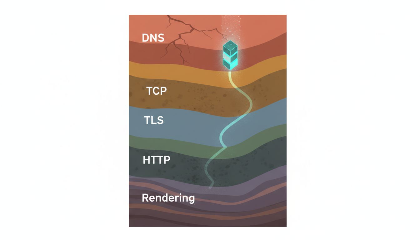
This creates a practical problem for product teams. They optimize for what they can measure: server response times, time-to-first-byte, JavaScript bundle sizes. These are real metrics, and improving them matters. But users do not experience your application through a monitoring dashboard. They experience it through feel. And feel is governed by a different set of rules than throughput.
The surprising finding from decades of human-computer interaction research is that a slower application can feel faster than a genuinely quicker one, depending on how it handles the time it takes. The inverse is also true: a fast application can feel sluggish if it handles transitions poorly. Engineering time spent on the latter problem is frequently worth more than time spent shaving additional milliseconds off backend response.
What the Brain Is Actually Measuring
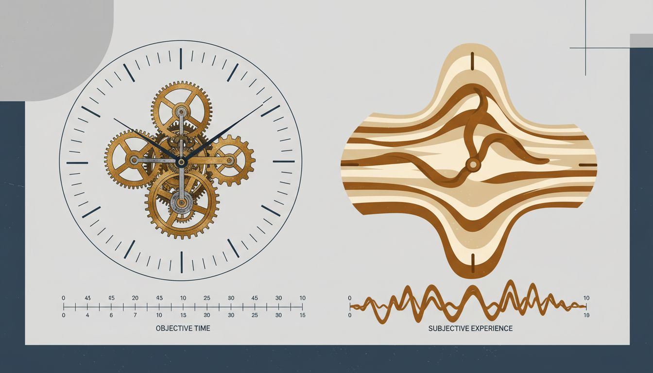
Human perception of time is not linear. It is heavily context-dependent. Psychologists distinguish between objective duration (how long something actually takes) and subjective duration (how long it seems to take). The two diverge constantly, and the divergence follows predictable patterns.
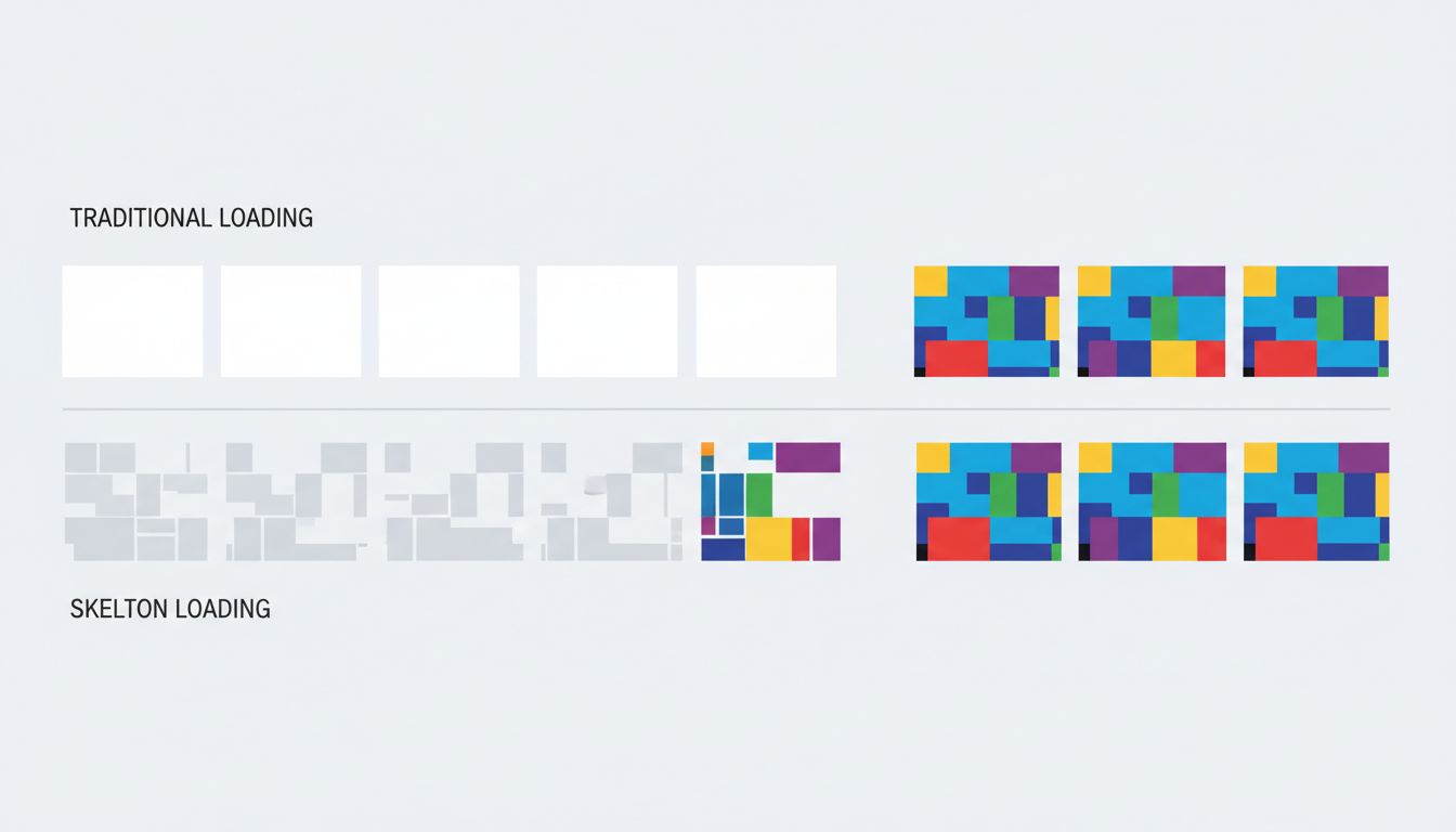
Idle time feels longer than occupied time. This is why music plays in elevator lobbies and why progress bars exist. A user staring at a blank screen for two seconds experiences those two seconds differently than a user watching a skeleton screen fill in over the same period. The content hasn’t loaded faster in the second case. The wait has been reframed.
Uncertainty amplifies perceived duration. When users don’t know whether an action registered, whether the system is working, or how long they’ll be waiting, subjective time stretches. A spinner without context is worse than a spinner with a stage label. A stage label with a rough estimate is better still. The information doesn’t change the objective wait. It changes what the wait feels like.
The beginning and end of an experience are weighted more heavily than the middle. This is a well-documented psychological effect (sometimes called the peak-end rule) with direct implications for app design. If your application loads slowly but snaps into full interactivity with satisfying feedback, users remember it as faster than an application that loads incrementally but ends on a clunky final render.
The Business Case for Perceived Speed
You might reasonably ask whether this is a UX nicety or something with financial stakes. The data suggests the latter, clearly.
Amazon has reported, in various forms over the years, that small latency increases correlate with measurable revenue drops. Walmart found that improving load time correlated with improved conversion rates. The specific numbers vary across reports, and the causal chains are complex, but the direction is consistent across companies and studies: users leave slower-feeling experiences, and they buy less from them before leaving.
What’s less discussed is that many of these improvements came not from infrastructure upgrades but from perception management. Optimistic UI updates, where the interface responds to a user action immediately and reconciles with the server afterward, make applications feel dramatically faster without touching server response time. Tools like skeleton screens, content placeholders, and progressive image loading exist entirely to manage the subjective experience of waiting.
The engineering cost of these approaches is often lower than backend optimization work, and the user-facing return is frequently higher. A product team that improves its 95th-percentile server response time from 400ms to 350ms has done real work. A team that adds a skeleton screen to a previously blank loading state may have done more valuable work, for less effort.
Optimistic UI and the Sleight of Hand
Optimistic UI is worth examining closely because it represents the clearest example of trading actual speed for perceived speed, and it’s a trade worth making in most cases.
The pattern works like this: when a user takes an action (liking a post, sending a message, checking off a task), the interface updates immediately as if the action succeeded, before the server has confirmed anything. If the server later reports an error, the interface rolls back. Users rarely see the rollback, because failures are infrequent. What they always see is an application that responds to their input instantly.
Twitter (now X) used this pattern for the like button. Slack uses it extensively for message sending. The underlying network latency hasn’t changed. The experience of using the product has.
The tradeoff is real: you are making a promise the server hasn’t confirmed yet, and you need error-handling logic for when the promise breaks. For applications where actions occasionally fail, the rollback experience can be jarring. Teams need to think carefully about which interactions are candidates for optimistic updates and which carry enough risk of failure that they should wait for confirmation. But the pattern’s existence as a mainstream approach reflects how seriously the best product teams treat perception.
Progress as Product
Progress indicators are older than software. The reason they’ve persisted for decades is that they work. But most implementations treat them as a binary: either there’s a spinner or there isn’t. The research on what makes progress indicators effective is more nuanced.
Studes by researchers Brad Myers (in early work at Carnegie Mellon) and later by others building on that foundation found that progress bars are not created equal. A progress bar that accelerates toward completion feels faster than one that moves linearly, even if total time is identical. Users prefer indicators that suggest momentum.
The implication is that a progress bar isn’t just a piece of UI furniture. It’s a communication tool, and its design affects how users experience time. Teams that implement a generic spinner and move on are leaving user experience quality on the table.
Stage-based progress (“Uploading… Processing… Almost done”) is more effective than a bare percentage counter because it communicates that work is happening, not just that time is passing. It also sets expectations. Users who know they’re in a three-stage process feel less anxious than users watching an opaque indicator tick upward.
The Infrastructure Trap
None of this means raw performance doesn’t matter. It does. Pages that take more than three seconds to load on mobile lose a substantial share of users before they’ve seen anything. Google’s Core Web Vitals make performance a ranking factor. There is a floor below which no perception trick compensates.
But above that floor, the relationship between engineering investment and user experience improvement is not linear. Cutting load time from 800ms to 400ms is likely to produce a noticeable improvement in user satisfaction and retention. Cutting it from 400ms to 200ms is a harder engineering problem that may produce a smaller perceptual gain, because 400ms is already within the range where other factors dominate how speed is experienced.
Companies that treat performance purely as an infrastructure problem, to be solved by faster servers and more CDN nodes, often discover they’ve spent significant money on improvements users can’t feel. The more precise framing is that performance has two components: the part users can feel directly (it’s fast or it isn’t) and the part that is felt through design (the wait is managed well or it isn’t). The second component is cheaper to improve and frequently undertreated.
What Designers and Engineers Argue About
The perception problem creates a recurring organizational tension. Engineers want to measure real performance. Designers want to improve the experience of waiting. These goals are not in conflict, but they are funded differently and prioritized differently, and the people making prioritization decisions usually understand one better than the other.
The healthiest teams treat perceived speed as a shared metric. Some companies have gotten explicit about this, running user studies to measure satisfaction with wait times rather than relying solely on technical benchmarks. The data from those studies has a way of clarifying investment decisions.
The alternative, treating performance as a pure engineering concern and UX as decoration applied afterward, produces applications that benchmark well and feel slow. Users don’t file bug reports about subjective experience. They just churn.
What This Means
If you’re building or managing a product, a few things follow from the evidence:
First, measure what users feel, not just what servers report. Time-to-interactive and Core Web Vitals are proxies for perception, but user testing with real wait scenarios gives you ground truth.
Second, prioritize removing uncertainty before removing milliseconds. A 200ms load with no feedback feels worse than a 500ms load with a skeleton screen. Address blank states, missing feedback, and unexplained delays before investing in infrastructure upgrades.
Third, optimistic UI is underused outside of consumer apps. Enterprise software teams consistently underestimate how much the pattern improves perceived responsiveness, possibly because they’re less likely to have user researchers testing it.
Fourth, progress isn’t just visual. Audio feedback, haptic response on mobile, and micro-animations all register as responsiveness cues. An application that acknowledges input in multiple channels feels more alive than one that relies on a single visual update.
Actual speed creates the floor. Perceived speed determines where you land above it. Most teams optimize hard for the floor and neglect everything above it, which means the opportunity to differentiate on feel is, for most products, still wide open.