The Inbox That Never Empties
You’ve probably felt this: you open your task manager, scan a list of forty-three items, add two more things you just thought of, and close the app without finishing anything. The list grows. You feel busy. Nothing ships.
This is not a discipline problem. It’s a design problem.
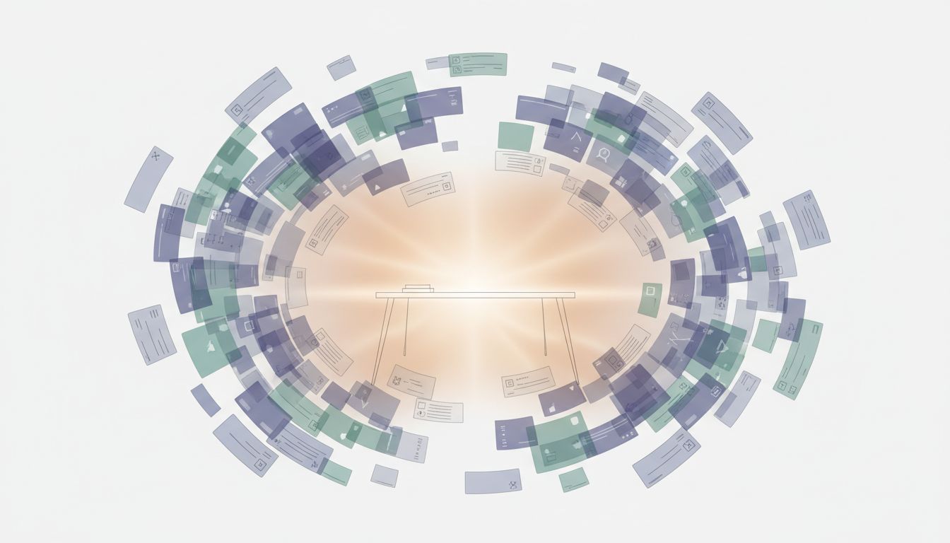
Every major to-do application, from Todoist to Things to Notion to a plain text file, is optimized for one thing: frictionless capture. Adding a task takes seconds. The apps reward you for it with clean typography, satisfying checkboxes, and the implicit promise that captured thoughts are handled thoughts. They are not. They are just stored.
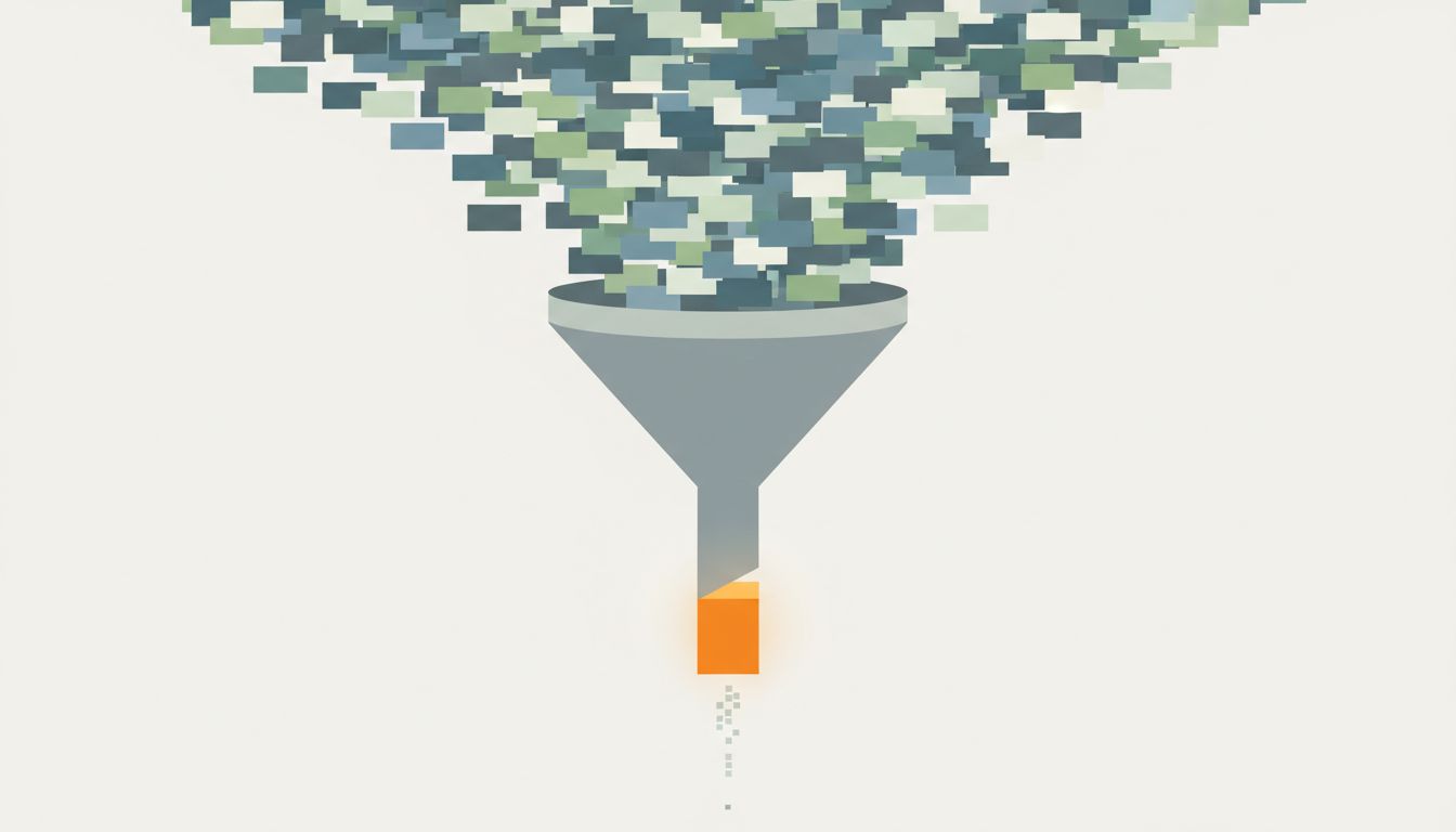
The result is a productivity system with a very good intake valve and almost no exhaust. Tasks accumulate. Lists grow. And you spend more mental energy managing the list than doing the work on it.
Why Capture Feels Like Progress
There’s a psychological mechanism at work here worth understanding. When you write something down, your brain registers a small sense of relief. The task is “handled” in a vague way. Researchers studying this phenomenon, building on work by Roy Baumeister and colleagues on the Zeigarnik effect, have found that simply making a plan to do something reduces the intrusive mental load of that thing. You feel more organized after adding to your list, even though the list just got longer.
App designers know this. Capture is the moment of highest emotional reward in the task management loop, so apps are designed around it. The quick-add shortcut. The inbox. The email-to-task integration. The voice capture on your phone. All of it is built to make adding tasks feel effortless and good.
Completion, by contrast, gets one checkbox.
The Structural Imbalance in Your System
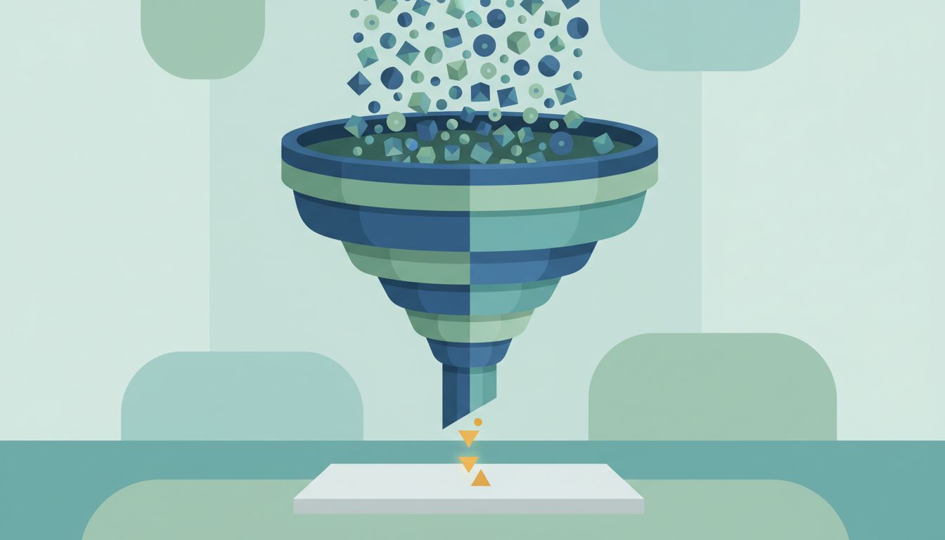
Think about your task list as a queue. A healthy queue has roughly balanced throughput: things go in, things come out. Your to-do list, almost certainly, has inflow that exceeds outflow.
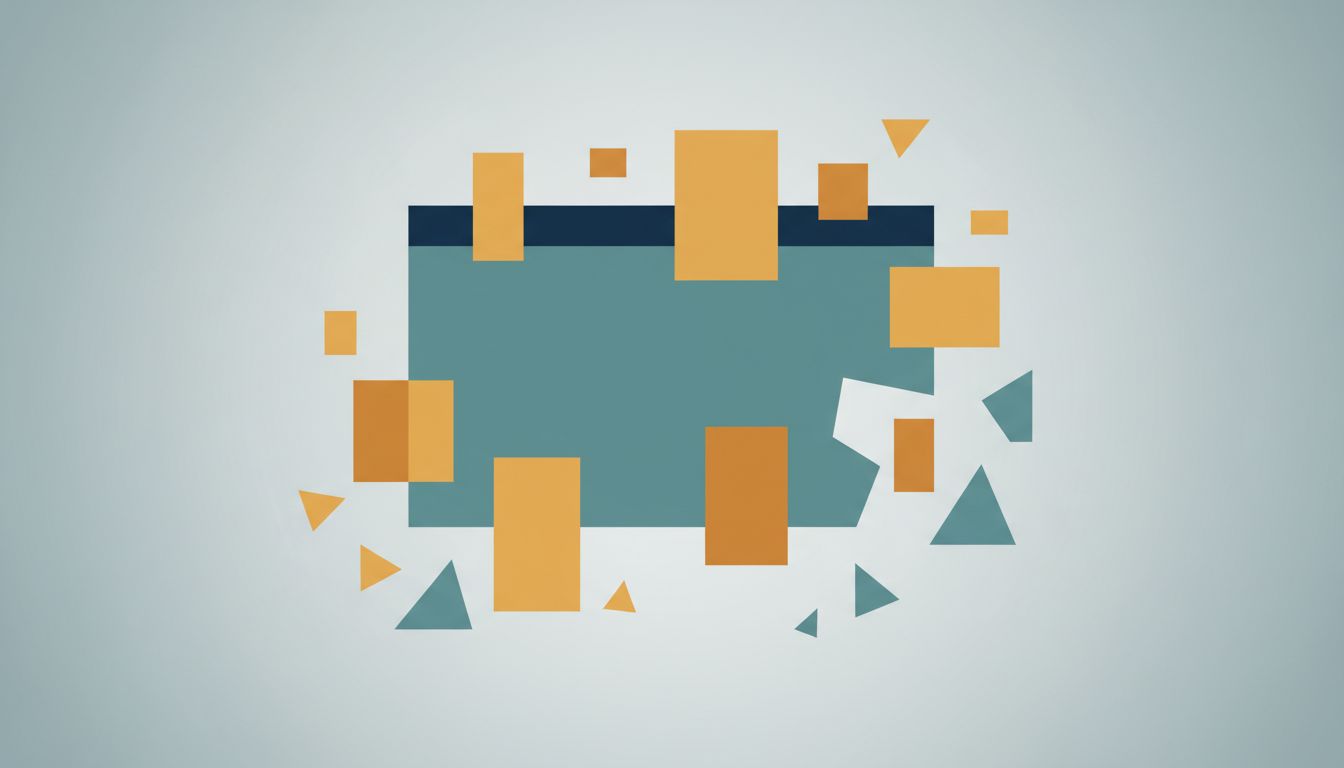
Part of this is a feature mismatch. The apps give you rich tools for organizing inputs: tags, projects, priorities, due dates, areas of responsibility. These tools feel useful because they make the list look more manageable. But organized clutter is still clutter. You can spend thirty minutes building a perfect project hierarchy and end the session having completed zero tasks.
The tools for finishing work are comparatively thin. Most apps offer a done state and not much else. There’s no friction when a task ages without being completed. No alert when your inbox hits forty items. No mechanism to force a decision between “do this” and “delete this.” The system is infinitely patient with accumulation.
This asymmetry compounds. A longer list requires more scanning time. More scanning time means more context-switching before you start any given task. More context-switching means more fatigue, which means you’re more likely to cope by adding something manageable to your list rather than tackling something hard. The list feeds itself.
What a Completion-Optimized System Actually Looks Like
If you redesign your system around finishing rather than capturing, several things change structurally.
The list has a cap. Not a soft suggestion, a hard one. If your active task list has more than ten items on it, something needs to leave before something new enters. This forces a decision you’d otherwise defer: is this thing actually worth doing? Constraints like this are uncomfortable at first and clarifying within a week.
There is a required decision moment. The best version of this is a daily or weekly review where you look at every item and explicitly choose one of three fates: do it, delete it, or defer it to a date you’ll actually revisit. The review is where the list shrinks. Most productivity systems describe a review process but build no mechanism that requires you to do it.
Capture is separated from planning. Your inbox can be a holding zone, but nothing in the inbox counts as a commitment. A task becomes real when you assign it a place and a rough time, not when you write it down. This breaks the psychological illusion that captured equals handled.
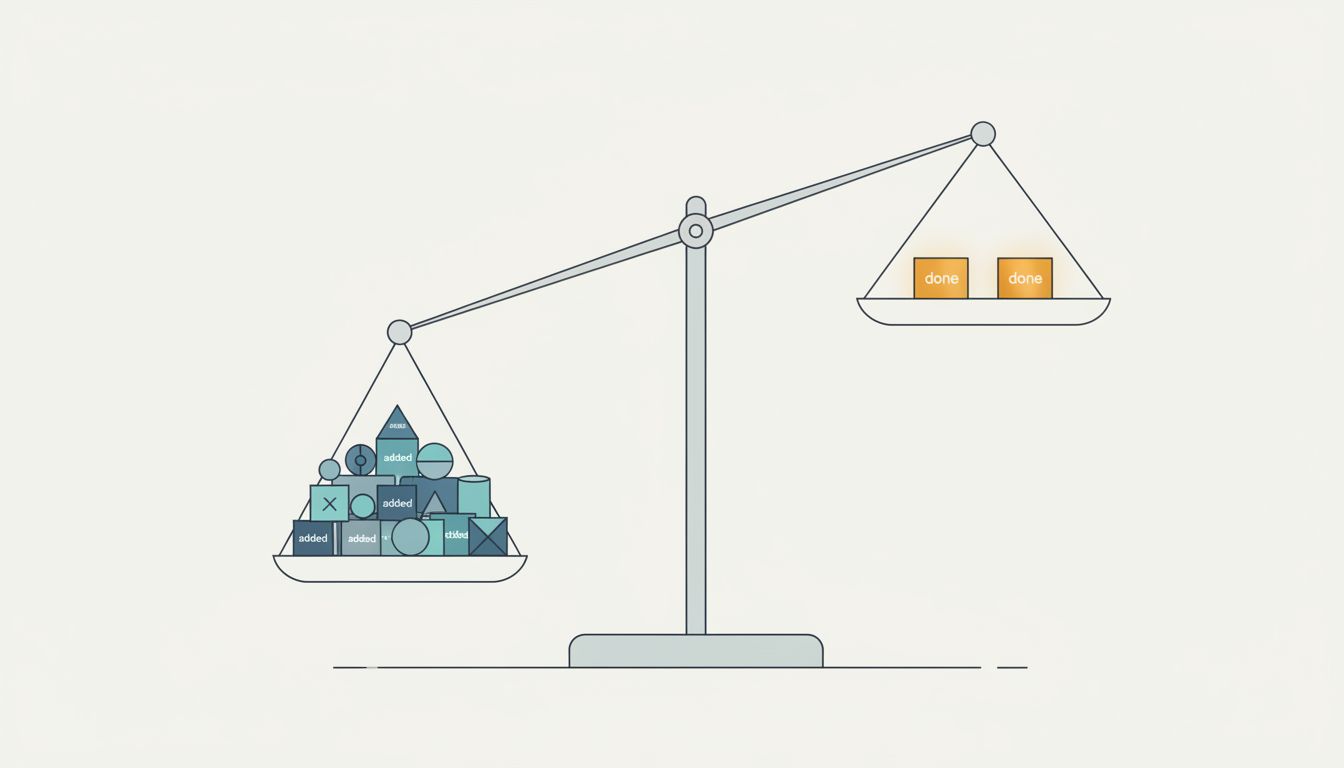
You measure completions, not additions. If you track anything about your productivity, track how many tasks you finish per week, not how many you add. This shifts your optimization target. If you notice your additions-to-completions ratio is three-to-one, you know something is wrong before the list gets unmanageable. The same principle applies to any system built around metrics: fewer, better-chosen measures beat more of them.
The Weekly Purge Is Non-Negotiable
If you implement one thing from this article, make it this: once a week, every task on your list that is more than two weeks old gets deleted or gets a specific date it moves to. No exceptions, no “keep just in case.”
This feels violent when you start. You will have tasks you’ve been carrying for months, things you’re certain are important. Delete them anyway, or schedule them for a specific future date when you’ll honestly look at them again. If something is genuinely important, it will come back. If it doesn’t come back, it wasn’t important.
The weekly purge does something the apps don’t do for you: it creates a cost for adding tasks you don’t act on. Right now, adding a task is free. The purge makes it cost something, because tasks you add carelessly will be tasks you have to consciously delete later. That’s a small friction, but it’s enough to make you think twice before capturing a half-formed idea as a formal task.
Choosing the Right Tool for a Completion-First Approach
Most apps can be made to work if you impose the right constraints externally. A few design choices help more than others.
Simpler tools tend to outperform more sophisticated ones for completion rate, not because features are bad, but because features seduce you into organizing instead of doing. A plain list with no tags, no projects, and no nested subtasks forces every decision into a binary: do this now or delete it. That’s useful.
If you use a richer tool, keep your active view intentionally limited. Todoist’s Today and Next 7 Days views are more useful than the full project list because they create a bounded horizon. Things’ Today view works similarly. The key is that you should never be staring at everything at once. Everything at once is how you choose nothing.
For people whose work is heavily deadline-driven, a time-blocked calendar often works better than a task list for the most important work. If a task lives in your calendar as an actual appointment, it has a start time and an end time and a cost to reschedule. That’s completion-optimized by design in a way a checkbox never quite is.
What This Means
Your task manager is not neutral. It is built to feel useful while helping you accumulate, not complete. Understanding that bias is the first step to working against it.
The practical changes are not complicated. Cap your active list. Enforce a weekly review with teeth. Separate capture from commitment. Track completions, not additions. These are boring suggestions, which is exactly why they work. Productivity systems fail because they’re interesting to build and tedious to maintain. The goal is to make the maintenance automatic enough that it happens even when you’re not motivated.
The measure of a good task system isn’t how well-organized your list looks. It’s how empty it gets.