
The Document You Share Is Not the Document People Read
You finish a spec, a proposal, a design doc. You’ve been careful. You’ve read it twice. You hit share and move on. What happens next is not what you think.
The document that lands in someone’s inbox or Notion workspace or Google Drive is not the document you wrote. It’s a rendering of it, filtered through fonts they didn’t choose, default zoom levels, light or dark mode, a screen that might be 13 inches or 27 inches, and a reading context you had no control over. But that’s the shallow version of the problem. The deeper version is about information architecture, reading order, and the brutal reality that most people do not read documents the way writers imagine they do.
How Reading Actually Works
Readers scan before they read. This isn’t laziness; it’s a rational allocation of attention. When someone opens your document, they’re making a bet: is this worth sequential attention or pattern-matching attention? Eye-tracking research going back decades (the Nielsen Norman Group has published extensively on this) shows that readers on screens follow an F-shaped or Z-shaped pattern, hitting the first line heavily, then scanning down the left margin, occasionally darting right when something catches their eye.
What this means in practice: your third paragraph, where you buried the decision you actually need made, received approximately zero sustained attention. The reader’s brain flagged the heading, sampled the first sentence, and moved on. They formed a mental model of your document from the parts they scanned, and that model is almost certainly wrong relative to what you intended.
The mismatch isn’t a failure of the reader. It’s a failure to design the document for the way reading actually works.
The Rendering Problem Is Real and Technical
Before we even get to comprehension, there’s a more mechanical problem worth taking seriously. Rich text documents render differently depending on where they’re opened.
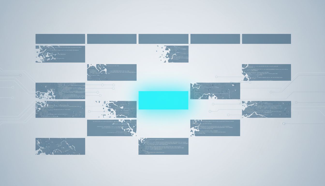
A Word document emailed to someone who opens it in Word on Windows looks different from the same file opened in Word on macOS, which looks different from it opened in Google Docs via the “Open with” menu, which looks different from the preview pane in Outlook. Fonts substitute. Tables reflow. Page breaks shift. Margins change. A document carefully formatted to put a critical table above the fold on page one might render with that table falling to page two in a different environment.
PDF was invented specifically to solve this problem (the “Portable” in the name is doing real work), but PDFs introduce their own issues: they’re harder to comment on collaboratively, they don’t reflow for mobile screens, and they age badly when the underlying data changes.
Markdown-based documents (in tools like Notion, Confluence, or GitHub) solve the rendering inconsistency but trade it for a different problem: every platform renders Markdown slightly differently, and features like callout boxes or embedded tables are proprietary extensions that don’t survive copy-paste.
There’s no rendering-neutral format. Every choice is a tradeoff, and most people making that choice aren’t thinking about it at all.
The Context Collapse of Async Communication
When you wrote the document, you had a context: you knew what meeting precipitated it, what decisions were pending, who the key stakeholders were, and what your document was arguing against. That context lived in your head and probably didn’t make it into the document, because it felt obvious to you.
For the reader, none of that is obvious. They’re opening your document in a gap between two other tasks, having just come from a meeting you weren’t in, with a set of concerns that may be completely orthogonal to yours. The document doesn’t arrive in a vacuum, but it also doesn’t arrive with your mental context attached.
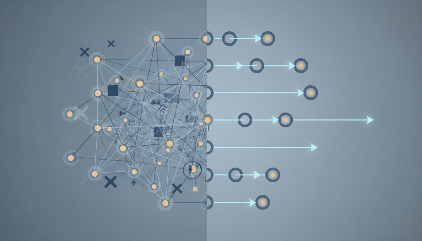
This is the information asymmetry that kills most written communication in organizations. The writer assumes shared context that the reader doesn’t have. The reader fills in the gaps with their own context, which is different. The result is that two people read the same document and come away with genuinely different understandings of what it says, and both of them are reading it accurately given their starting assumptions.
Software engineers run into a version of this constantly with technical documentation. A README that seems obvious to the person who wrote it (who knows the system’s history, the assumptions it makes, the environment it expects) is opaque to the person setting it up for the first time. The document is technically complete. It’s communicatively broken.
Structure Is a Load-Bearing Element
The hierarchy of your document, how you use headings, where you put the conclusion, how you handle summaries, is not decoration. It’s the scaffolding readers use to navigate.
A document that buries its recommendation in section four, after three sections of context and methodology, will consistently produce a class of readers who never get to the recommendation. This is not hypothetical. If you’ve ever sent a document and gotten a response that asks a question you answered in section four, you’ve experienced this firsthand.
The fix is unglamorous: put the conclusion first. Not as a teaser, as the actual conclusion. Then provide the supporting reasoning for the people who need it. This is the inverted pyramid structure that journalists have used for a century, and it works because it respects the reality that different readers need different depths of information.
For technical documents specifically, this means: state the decision or recommendation in the first paragraph, follow with a “Why” section that could be read or skipped, then provide details and alternatives for readers who want the full picture. Amazon’s PR/FAQ format and Google’s design doc conventions both push toward this, not because these companies discovered some novel insight, but because they noticed that their internal documents weren’t actually being understood.
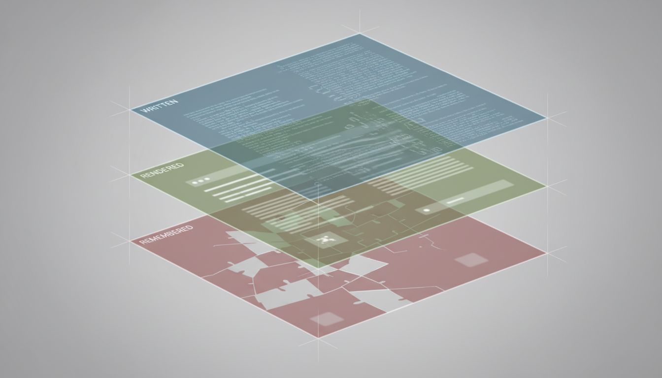
The Version Nobody Talks About
There’s a third document in this chain that gets almost no attention: the one that exists in the reader’s memory after they’ve closed the tab.
People don’t retain documents. They retain impressions of documents, summaries constructed by their own brain from whatever they actually read and processed. That mental summary will drift from the original over time, mixing with other information they’ve encountered and the conclusions they were already inclined to draw.
If your document was the basis for a decision made in a meeting three weeks after it was shared, the decision was made against people’s memories of the document, not the document itself. Those memories have been shaped by discussions, other information, and the selective retention that human cognition performs on everything.
This isn’t a solvable problem in the sense of “use the right tool.” It’s a fundamental property of written communication as a coordination mechanism. The implication is that documents alone are rarely sufficient for high-stakes decisions. They need to be accompanied by conversations that surface misreadings and fill in context gaps before decisions get made. The document is the artifact; understanding has to be actively built.
What Actually Helps
There are a few concrete practices that reduce the gap between what you wrote and what people receive.
Lead with the ask or the answer. If your document is requesting a decision, say what decision in the first sentence. If it’s providing a recommendation, state the recommendation before the reasoning. Readers who only skim will at least know what the document is about.
Design for the most distracted read. Assume someone will read your document on their phone, in portrait mode, between two notifications, with about forty seconds of attention. What do they need to get from those forty seconds? Make sure that information is available in those forty seconds. The full document can be there for the people who need it.
Surface your assumptions explicitly. The context that lives in your head should be in a short “Context” or “Background” section at the top. Not as a long setup, as a brief declaration: “This document assumes X, is arguing against Y, and was written after Z.” Two or three sentences. This hands the reader the mental model they need to interpret the rest correctly.
Follow up on the document, not just with the document. Sending a link and assuming it was understood is optimistic to the point of recklessness for anything consequential. A short verbal or synchronous walkthrough of a document’s key points catches misreadings before they compound into bad decisions.
Version explicitly and visibly. If a document has been revised, make it obvious what changed and why. Readers who saw version one will apply that mental model to version two unless you actively disrupt it.
What This Means in Practice
The document you share is, at best, a starting point for the understanding you’re trying to create. The rendering might differ. The reading order will almost certainly differ from your writing order. The context the reader brings will be different from the context you had. And the version of your document that persists in memory will drift further still.
None of this means documents aren’t worth writing. They are: they create accountability, they’re searchable, they force clarity of thought, and they scale in ways that conversations don’t. But treating a shared document as a completed act of communication is where organizations consistently go wrong.
The document is necessary but not sufficient. What you’re actually doing when you write a document is creating a substrate for communication, not completing it.