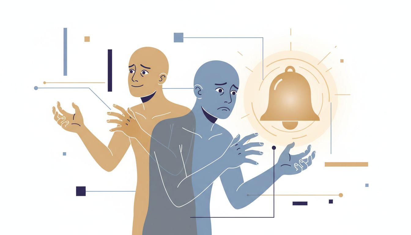

Most productivity software is built around a core interaction: adding a task. The text field is prominent, the shortcut is obvious, the feedback is instant. You type something, hit enter, and the app rewards you with a clean new row. The list grows. You feel organized.
The completion side of that equation gets almost no design attention by comparison. Checking something off is typically a small checkbox on the left, styled to be unobtrusive. Some apps animate it. Most just strike through the text and hide it. The emphasis is unmistakably on intake.
This isn’t an accident. It’s a product decision that makes a particular kind of sense if you’re optimizing for user engagement rather than user outcomes.
The Capture Loop Is Addictive by Design
Task capture feels productive because it activates the planning fallacy in a very specific way. When you write down “refactor the authentication module,” you get a small burst of forward-looking confidence. The task feels accounted for. Your brain partially relaxes as if something has been accomplished, even though nothing has.
Psychologists call this a “completion signal” arriving before completion. You’ve offloaded the cognitive burden of remembering the task, which is genuinely useful, but the relief can bleed into a false sense of progress. The list grows longer, and each addition reinforces the habit of adding rather than doing.
Tool design amplifies this. Todoist, Things, Notion, Linear, GitHub Issues, all of them make adding a task faster than triaging or closing one. The hot key for “new task” is always more prominent than the workflow for archiving stale work. There’s a reason for this: adding tasks keeps users in the app. Finishing tasks and closing the app is the opposite of engagement.
The Backlog Grows Until It Becomes Useless
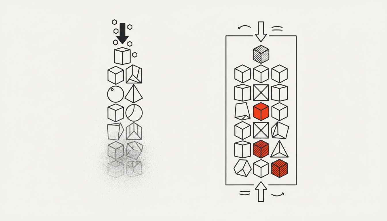
Here’s where the structural problem becomes concrete. A to-do list with 200 items is not a productivity tool. It’s a graveyard with a search bar.
Think about what happens to a software project’s issue tracker after two or three years without aggressive triage. You end up with hundreds of open issues that range from critical bugs to someone’s 2021 idea for a dark mode that nobody wanted. The signal-to-noise ratio collapses. Engineers stop trusting the backlog because half of it is irrelevant, so they route around it, and now you have two systems: the official one and the informal one people actually use.
Personal to-do lists follow the same arc. Once the list is long enough that you can’t scan it in thirty seconds, you stop consulting it. You start operating from memory or from whatever is most recently added, which means you’ve essentially built a LIFO stack (last in, first out) on top of a system designed to be a priority queue. The old, important work sits at the bottom. The new, possibly-unimportant work gets done first.
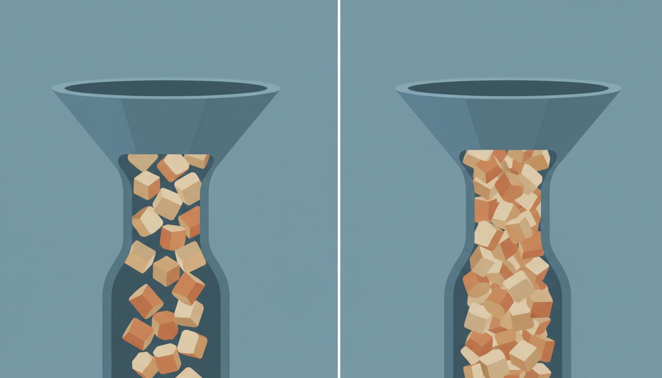
This is the same failure mode as an unbounded queue in a distributed system. When the queue grows faster than it drains, you have a throughput problem. The solution isn’t to add more items faster. It’s to either increase the drain rate or reject items at the intake point. Most productivity advice focuses on the first. The second option, being selective about what you even add to the list, almost never gets discussed.
What a Well-Designed Completion System Would Actually Look Like
If you designed a task manager around finishing rather than capturing, the constraints would look different.
First, the list would be bounded. Not by an arbitrary number, but by what’s actually workable. David Allen’s Getting Things Done methodology gets close to this with its concept of a “Next Actions” list, the idea being that a task only belongs on your active list if you could do it right now, given your context. That’s a genuine filter. Most tools implement GTD’s capture step but ignore the processing step, which is where the filtering happens.
Second, adding a task would require some friction when the list is long. Not punitive friction, but the kind that forces a quick acknowledgment that you’re adding to something already crowded. This is how good pull request review processes work: before you open a new PR, you check whether there’s already a queue of unreviewed code waiting. The discipline is systemic, not just individual.
Third, the interface would surface aging tasks more aggressively. If something has been on your list for three weeks without being touched, it should be visually distinct, not because guilt is a good motivator, but because a task that old either needs a deadline, a decision to abandon it, or a reason it keeps getting skipped. The absence of that signal is a design gap. Notion and Obsidian let you query by created date, but you have to build that view yourself. It should be the default.
The Difference Between a List and a Decision System
This is the crux of it. A to-do list is not inherently a decision system. It’s a memory aid. The decision layer, what to work on, in what order, and what to drop entirely, lives outside the tool and mostly inside your head. That’s where most people’s productivity system breaks down, not because they’re disorganized, but because they’re using a memory aid as if it were a decision framework.
A genuine decision system has to answer three questions that a list doesn’t: what can I actually finish today given real constraints, what happens if I don’t finish a given item, and what should I stop trying to do entirely. The third question is the one nobody wants to ask because the answer involves admitting the list has been lying to you about what’s important.
Calendar blocking is one approach to forcing that decision layer. When you have to assign a task to a specific time slot, you immediately confront resource scarcity. You have eight hours. The slots fill up. Now you can see that your 47-item to-do list represents about three weeks of work, not one day. The list was hiding that fact.
Why the Tools Won’t Fix This for You
It would be convenient if the next task manager update solved this. It won’t, and the reason is structural. The business model for most productivity software depends on daily active users. A tool that genuinely optimized for you finishing your work and closing the app would need a very different monetization strategy than one that keeps you inside a rich, feature-laden interface.
This doesn’t mean the tools are malicious. It means their incentives and your interests are misaligned in a specific, predictable way. Your notification settings face the same dynamic: the defaults are tuned for the app’s engagement, not your attention.
The implication is that you have to impose the decision layer yourself, with whatever tool you happen to use. The most effective thing most people can do is not switch apps. It’s to treat the weekly review, the genuine, uncomfortable process of looking at old tasks and deciding what’s actually still relevant, as a non-negotiable maintenance task. Like garbage collection in a runtime: if you never run it, the heap fills up and everything slows down.
What This Means
The core problem is not that you’re bad at finishing tasks. It’s that you’ve been using a capture-optimized tool and expecting completion-optimized behavior out of it. Those are different jobs.
The list you maintain is, right now, probably longer than it should be. Some fraction of those items are stale, were added impulsively, or represent commitments that no longer make sense given how your priorities have shifted. The tool is not going to tell you that. It has no incentive to.
The fix is a process change, not a tool change. A hard limit on active items. A weekly review that has teeth, meaning things actually get deleted, not just rescheduled. Calendar blocking to make the resource constraint visible. And a deliberate, slightly uncomfortable practice of saying no to new items when the list is already full.
The to-do list is a queue. Queues need both a push mechanism and a pop mechanism. You’ve been building an extremely efficient push. The pop is your job.