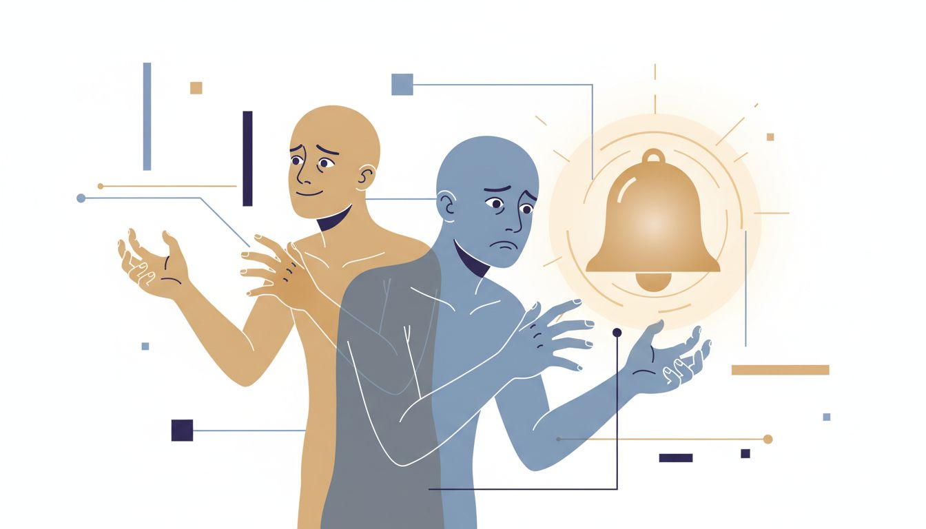
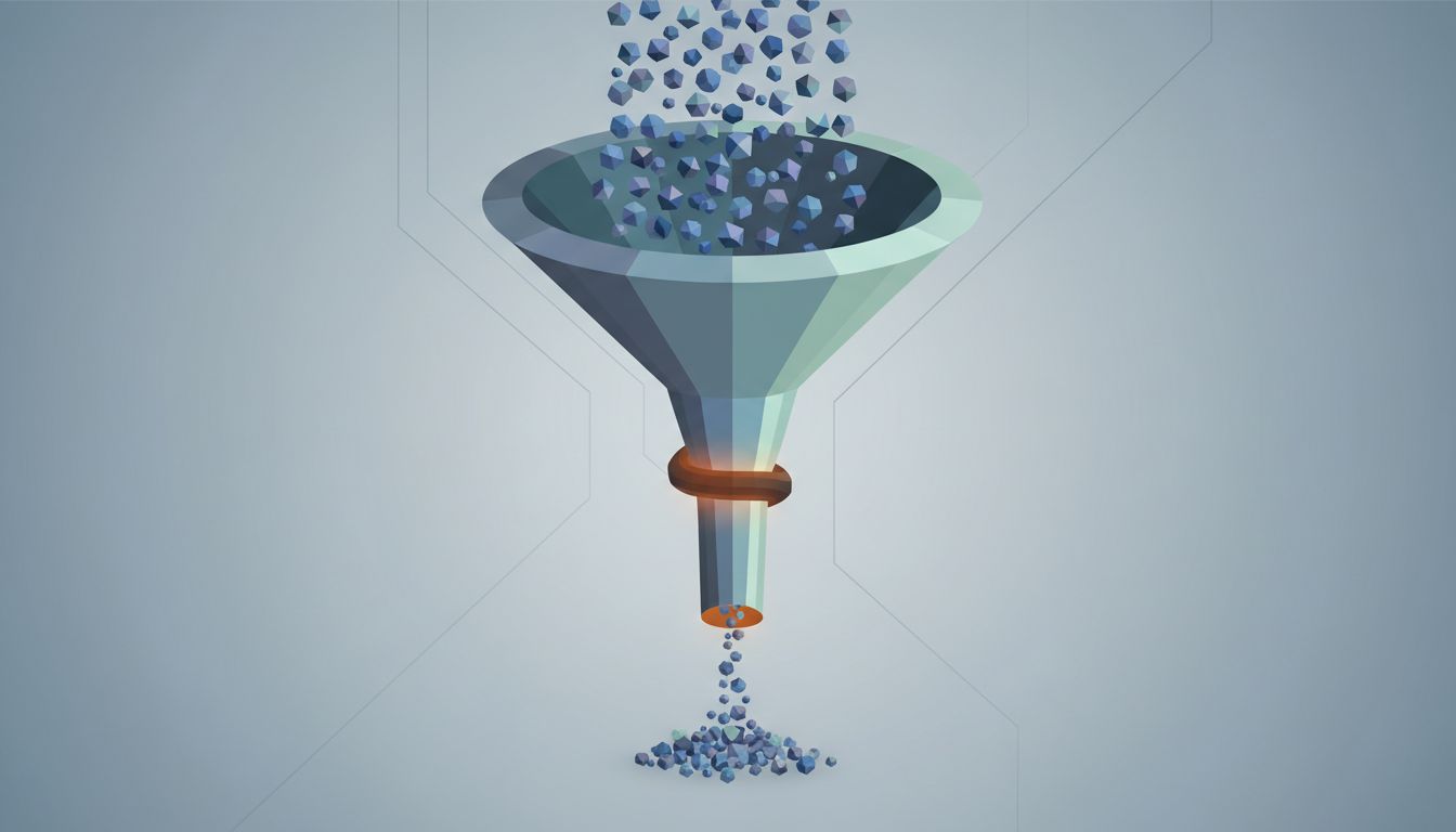
There is a fundamental asymmetry in how most to-do apps work. Adding a task takes two seconds. Completing one takes everything you have. Yet the entire interface is tuned for the former. The inbox is always one tap away. The quick-capture shortcut works from any screen. The satisfying sound plays when you type a task name. The friction lives entirely on the output side.
This is not an accident, and it is not malice. It is the natural result of optimizing for the metric that is easiest to measure: task volume. More tasks added feels like engagement. More tasks completed is harder to attribute to the app itself. So the apps get very good at one half of the job.
The Capture Bias Is Structural
Most modern productivity apps were designed around the GTD (Getting Things Done) principle that you should capture everything to get it out of your head. The logic is sound. An unwritten task is cognitive overhead, a background process consuming working memory without producing output. Getting it into a system frees up mental RAM.
The problem is that the capture step was always meant to be followed by a processing step, where you decide what each item actually means and whether it belongs in your system at all. That processing step is the hard part, and most apps have quietly let it atrophy. Notion, Todoist, Things 3, all of them make capture nearly frictionless. Processing a hundred items you captured in a distracted Tuesday afternoon is left as an exercise for the reader.
The result is a list that behaves like a write-only log. Items flow in continuously. The outflow depends entirely on willpower, which is a scarce and unreliable resource. When willpower runs low, the list keeps growing. You end up with a backlog that functions less like a system and more like a guilt ledger.
The Visibility Problem
Here is something worth sitting with: most to-do apps show you everything, all the time. Your 47-item list is right there, rendered in full, scrollable. This is presented as a feature. It is actually a significant design failure for anyone trying to finish work rather than catalog it.
Cognitive load research is consistent on this point. When the number of visible options increases, decision-making quality degrades. This is sometimes called choice overload, and it applies to task selection as much as it applies to picking a Netflix show. When you open your task manager and see 47 items, your brain has to do a selection sort every single time, scanning the full list, weighting priorities, accounting for context. That work happens before you do any actual work.
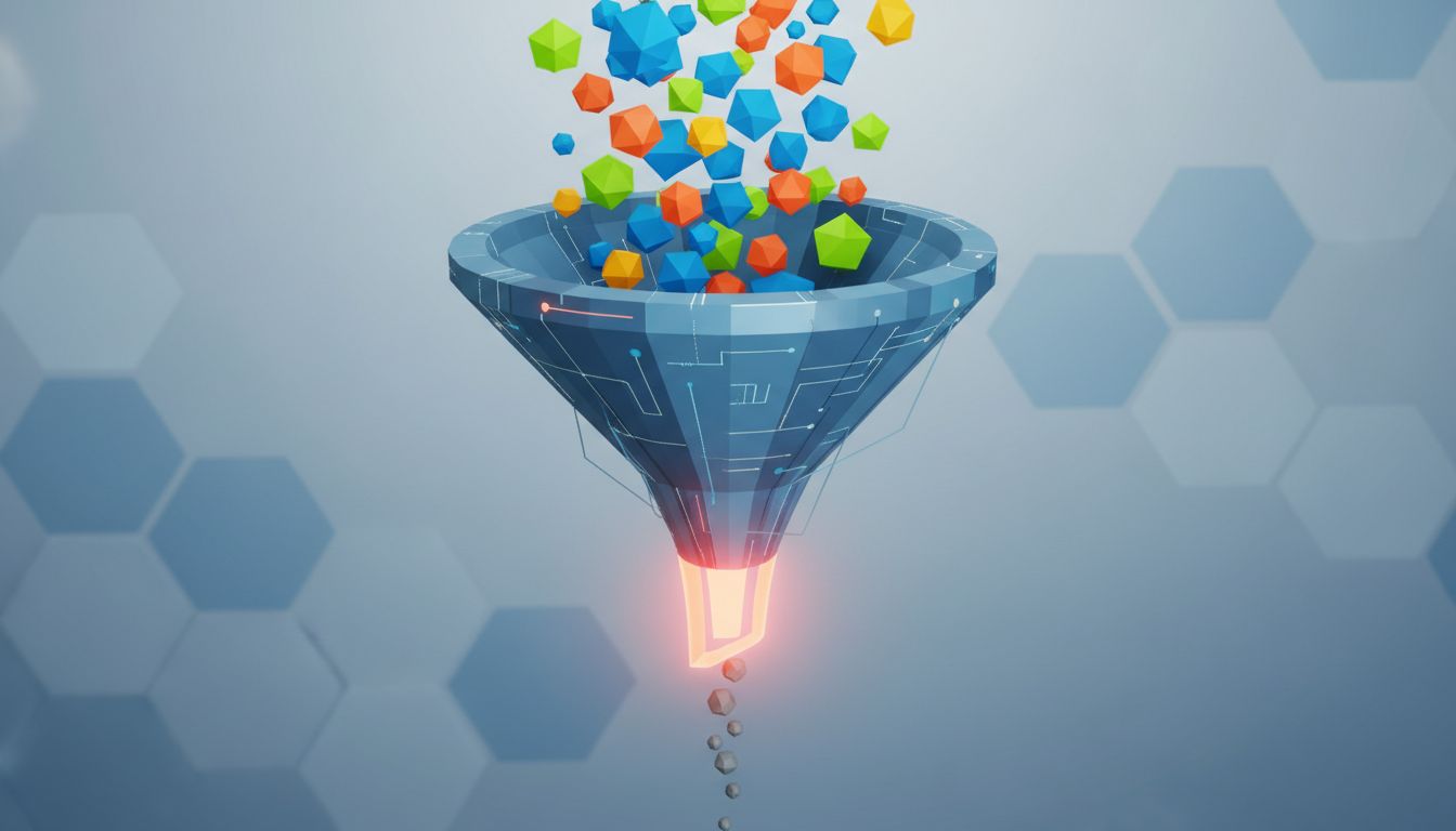
Compare this to how good engineering systems handle queue management. A well-designed job queue does not dump every pending task onto the worker simultaneously. It sends work in controlled batches matched to the worker’s capacity. The scheduler decides what goes next. The worker just executes. Your to-do list has no scheduler. You are both the scheduler and the worker, and context-switching between those two roles is expensive in ways that compound throughout a day.
The apps that have tried to address this, things like the daily three-task limit in some intentional productivity setups, tend to feel artificially constrained. That friction is doing real work, though. It forces the scheduling decision to happen once, deliberately, rather than repeatedly and reactively throughout the day. As noted in why discipline makes your to-do list longer, adding more structure to a broken system often just generates more overhead without more output.
Completion Mechanics Are an Afterthought
Open any major task manager and look at the affordances available when you complete a task. You tap a checkbox. Maybe there is a satisfying animation. The item disappears or gets a strikethrough. That is typically the entire interaction surface for the most important event in the system.
Now look at the affordances for adding a task. Natural language parsing that interprets “call Sarah tomorrow at 3pm” into a structured event with a contact link, a due date, and a time. Recurring task templates. Tags, projects, priorities, sub-tasks, attachments, notes. The input side of these systems is genuinely sophisticated. The output side is a checkbox.
This design signals, implicitly but clearly, that completion is the end of the story rather than data worth capturing. You never get asked: did this task accomplish what you expected? Was it worth doing? Did finishing it surface three more tasks? That feedback loop, if it existed, would make the system smarter over time. Instead, every completed task vanishes into a history log that almost nobody opens.
What a Completion-Oriented System Would Look Like
The fix is not a better app, necessarily. It is a different mental model for what the list is for.
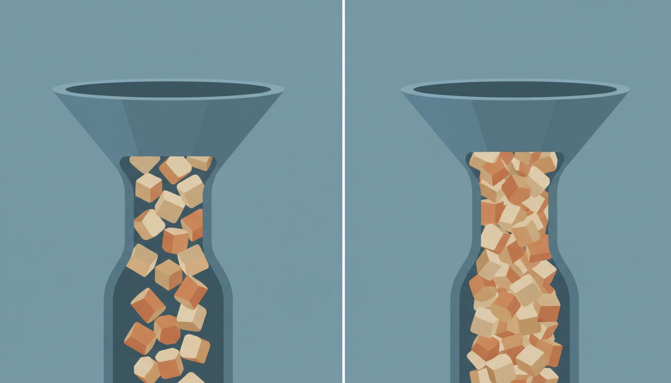
Think of your task list less like a database and more like a manufacturing line. A healthy manufacturing line has a concept called WIP limits (Work in Progress limits), a constraint on how many items can be in any given stage simultaneously. Kanban boards, which originated in Toyota’s production system, use WIP limits precisely because throughput improves when you restrict the queue rather than expand it. A line with twenty items in progress is a line where everything is stuck. A line with three items in progress is a line where things actually move.
Applying this to personal task management means accepting that a shorter visible list is often a more functional one. Not shorter because you deleted things irresponsibly, but shorter because you made deliberate decisions about what deserves your attention today and moved everything else out of sight. The task that keeps getting postponed is usually a signal worth examining, not a failure of willpower. (There is a clean treatment of exactly this in the task you keep postponing is probably wrong.)
The other change worth making is adding actual friction to task creation. This sounds counterintuitive, but a small amount of resistance at capture time, something as simple as requiring a single sentence about why this task matters, filters out the noise before it enters the system. Most items that feel urgent at the moment of capture will fail that basic test twenty-four hours later. Let them fail early.
A system that completes fewer tasks from a shorter list is not a worse system than one that adds hundreds of tasks and finishes a third of them. It is almost certainly a better one. The goal was never to have the most complete capture of everything you might possibly do. The goal was to actually do things.